
To help you land on the right blog layout (that’ll attract and retain more readers), we’re going to break down the most crucial blog layout best practices and highlight 12 of the most impressive blog layout examples from real-life websites, blogs, and publications—so that you can take inspiration from the best when designing your own blog layout.
By now, you’ve probably already started a blog of your own. You’re here for some inspiration (and advice) on coming up with the best possible blog layout that’ll create a great experience for your readers. And while writing great content and driving traffic are two of the top considerations for bloggers, one aspect you may not have put as much thought into (yet) is the overall design and layout of your blog.
Those who’ve already started blogging probably chose a WordPress theme at the beginning and allowed the general format of that theme to determine your blog’s layout… which is understandable (and what I did for several years here on my blog). Choosing a great theme is one way to make sure that your blog looks great, but it shouldn’t be the only factor in determining your blog layout.
Whether you’re just starting a blog—or thinking about redesigning your site, I’m going to show you several of the best blog layout examples, in addition to essential blog layout best practices you should follow in designing your blog. Be sure to check out these blog examples for even more inspiration, too.
12 Blog Layout Examples (and Best Practices to Follow) in 2026
- Fonts You Can Read
- Organize Your Blog Layout for Easier Access
- Design Your Blog Posts to Be Easily Scannable
- Utilize High-Quality Images (or Graphics)
- Consider Page Load Time
- Include Compelling CTAs (Calls to Action)
- The Fine Line Between Creative and Cluttered
- Encourage Engagement
- Brand Your Blog Layout
- Make Your Blog Layout Relate to Your Audience
- Blog Layout Examples to Learn From When Designing Your Blog
Disclosure: Please note that some of the links below are affiliate links, and at no additional cost to you, I’ll earn a commission. Know that I only recommend products and services I’ve personally used and stand behind. When you use one of my affiliate links, the company compensates me, which helps me run this blog and keep all of my in-depth content free of charge for readers (like you).
Why Does Your Blog Layout Matter?
Why do so many stress about their blog layout and design? Why does it really matter what your blog looks like—or how it’s designed?
Well, for one, people are very visual. Without giving it much thought, the vast majority of your readers will instantly judge your blog the second they land on it.
If your blog layout looks unprofessional, outdated, confusing, or unappealing—there’s a good chance they’re going to question your credibility (or simply leave).
Here are three crucial reasons why you should care about your blog layout and overall site design.
- High Bounce Rate: A high bounce rate is when readers come to your blog and leave very quickly. They don’t spend any real time on your blog, and they don’t click any of your internal links. While a high bounce rate is not solely dependent on your blog layout, it’s definitely a factor. Have you ever come across a blog post that looked like it was from the early 90s? Did you trust the content? Have you opened a blog post only to discover the text was almost impossible to read and there was an overwhelming amount of ads and popups? What do you do with these sites? Chances are, you press the back button and try to find a better source. You may even wonder why Google ranked that site well in the first place. This is why your blog layout matters. You want your blog to be welcoming to your visitors.
- Low Rate of Return Readers: Let’s say someone clicks a link to your blog post. Your article has good content and answers their questions. However, they felt your blog was poorly designed and difficult to consume information on. They probably won’t be returning to your blog in the future. That’s a problem because you want returning visitors. People who return to your blog will begin to feel loyal to you and your content. This loyal group of followers is more likely to promote your blog content to their networks—and sign up for your email newsletter. This is the most engaged group of people you can hope to have as a blogger.
- Trouble Navigating Your Blog: Your blog layout should be easy to navigate. Your visitors won’t spend a lot of time decoding your website, just to find out who you are or what your site is all about. They should be able to easily locate important links and develop a basic understanding of what your blog has to offer with very little effort.
Now that we’ve defined three compelling reasons why you should create a very thoughtful blog layout, let’s dive in and break down which blog layout elements are most important.
10 Blog Layout Best Practices (to Retain More Readers) in 2026
Though you’ll want your own blog to have a unique look within your niche, there are definitely some common best practices that all great blog layouts and designs share in common.
Here are ten best practices you can use in creating a winning blog layout today.
1. Fonts You Can Read
Choosing the right fonts for your blog sounds relatively simple, but it’s very important to the overall layout.
Your font choices shouldn’t detract from your content—they should be easy for your viewers to read.
What Font Size Should You Use?
- Font sizes that are too small will be difficult to read
- Medium to larger font sizes are preferable for online reading
- This is even more important for people who have a hard time seeing smaller fonts
Generally, you want to have your body text font size set at a minimum of 16px.
You may be using a font that’s naturally a little bit bigger, and therefore, you don’t need to go larger than 16px. Use your best judgment on this decision (based on who your readers are), but don’t be afraid to solicit feedback from real people.
Which Fonts Should You Use?
I recommend sticking to relatively basic fonts, at least for the body text (which people will be reading most). Simple fonts aren’t as visually exciting as some, but utilizing a simple font will be infinitely better for your readers—and will encourage them to keep progressing through your content, rather than turn around and run for the hills.
A good rule of thumb is to avoid any font that feels like a novelty. Try to choose fonts that are easy to read and will age well. Clean, simple and legible is the goal. Here are some examples of fonts that’d work well for just about any smart blog layout.
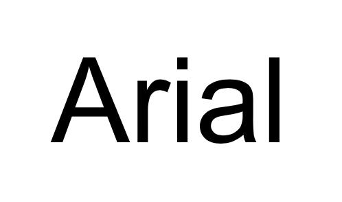
Arial is a very dependable font that won’t steer you wrong. It has nothing that really stands out about it, but that can be an advantage when it comes to legibility in your blog layout.
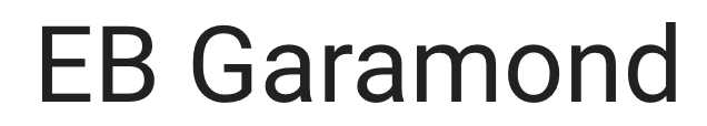
EB Garamond is another simple and easy-to-read font that I’ve used many times.
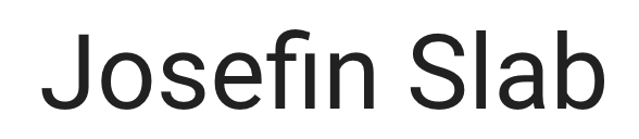
Josefin Slab is a slightly more stylized alternative to Arial but still retains an easy-to-read touch. My blog’s body text now uses a custom font these days, but it’s most similar to Josefin Slab.
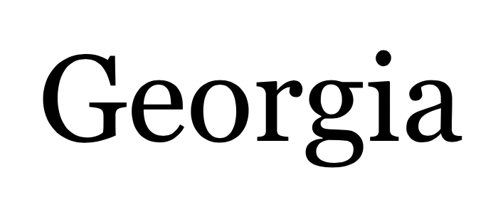
Georgia is one of the most widely used fonts for bloggers.
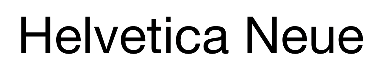
Helvetica Neue has been around since the early 1980s and comes in almost 100 different styles.
If you go with one of these five font types for your body text, you’ll be in great shape (and your readers will thank you for it).
Which Fonts Should You Avoid?
Now, to make sure you don’t choose a font that’ll scare your readers, let’s look at a few examples of fonts you should not use in your blog layout.
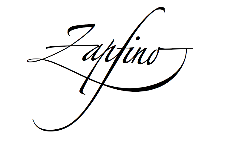
Zapfino might look cool, but it would be very difficult to read as a primary font.
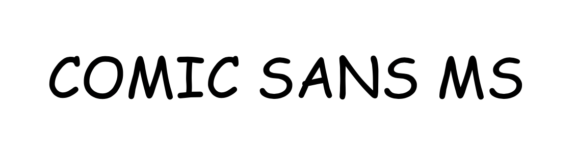
At one time, Comic Sans MS was a very popular font. In the 1990s, this font was everywhere. If you were to use this font today as your blog’s text you would definitely risk losing credibility. The hatred for Comic Sans is so real that people have written entire blog posts specifically talking about why people hate it so much.
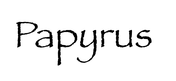
Papyrus is another font that gets a bad rep. Like Comic Sans, this font was a shooting star. It was popular for a time, but would not be considered a credible blog font today.
While you don’t need to choose one of the three fonts I recommended above for use in your blog layout, I highly recommend trying to pick a font that’s legible both for desktop readers and mobile device users—because if readers can’t actually read your blog posts, they’ll be gone in no time.
2. Organize Your Blog Layout for Easier Access
If you’ve already spent some time writing useful blog content, then you may have realized it can be hard to keep everything organized within an individual article (which is why I always start with a blog post outline), let alone from the macro perspective of your blog as a whole.
From the broader organizational standpoint, you may have written blog posts in various categories—and you need a way to separate them. Another issue is that if you’ve written some really great posts in the past, they’re now naturally sitting at the bottom of your blog feed, where nobody will ever find them.
Someone visiting your blog for the first time today, may not know the easiest way to navigate through your posts. And that’s a shame because you don’t want readers to miss out on finding your best content.
There are a lot of different ways to organize your blog content, but I’m going to give you a few ideas to help you start the process now. You can mix and match to find the best solution for your blog.
Tip #1: Pick a Defined Niche For Your Blog
One of the first things I recommend to new and experienced bloggers alike is to try and follow a somewhat narrow niche for your blog. That doesn’t mean that you have to write about the same thing every day, but there should be an overarching theme that you’re covering on your blog—an umbrella under which everything nicely sits within.
Sometimes bloggers want to write about what’s on their minds that day. This can work in small doses—or if you’re running a more personal story that you don’t intend on ever monetizing. But for those who are hoping to make money blogging consistently, it’s a good idea to pick a clear focus that your blog can eventually become known for. Why?
- For one, it’s a lot easier to rank your content in Google search results when your blog has a clear direction
- Another reason to pick a defined niche is so you can present a clear, consistent message to your blog readers
- A niche also makes it easier for people to search your site.
If your site tries to cover too many blog topics at once, it’s difficult to create a blog layout that cohesively connects all the main themes of your content. Your visitors won’t know what to expect, and you’ll struggle to come up with a feasible way to direct them where they want to be.
Here’s an example of a blogger who’s chosen a very clear niche for her content. Strength and Sunshine is a blog that shares recipes and information about vegan, gluten-free, and allergy-free foods (her description sits right underneath the logo).
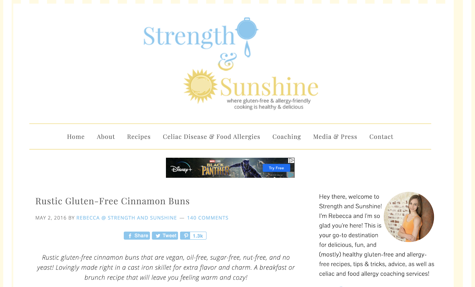
Every link in the top menu of her blog layout is related to this specific diet—and her readers can expect that every recipe shared (and every blog post written) will have something to do with gluten-free and allergy-friendly cooking.
Tip #2: Use a “Start Here” Link
Many bloggers like to use a link in their main navigation menu titled something like “Start Here.” It’s often similar to writing an About Me page, but it goes into greater detail and usually offers clear instructions about what readers should do next. It’s a good way to introduce new visitors to your blog and share what your content is all about.
Here’s a list of a few things you should consider adding to your “Start Here” page:
- An introduction about the blogger (or blog)
- Glossary of common terms used on the blog
- Links to your best and most popular content
- Shopping links if your blog sells digital or physical products
- Call to action like signing up for your blog’s newsletter
Now, let’s look at a great example of this in action. Clean Mama is a blogger who teaches people how to keep their homes clean (and is a very clever blog name idea, too).
She has a “Start Here” section on her blog that does a good job of identifying some of her blog’s most central ideas.
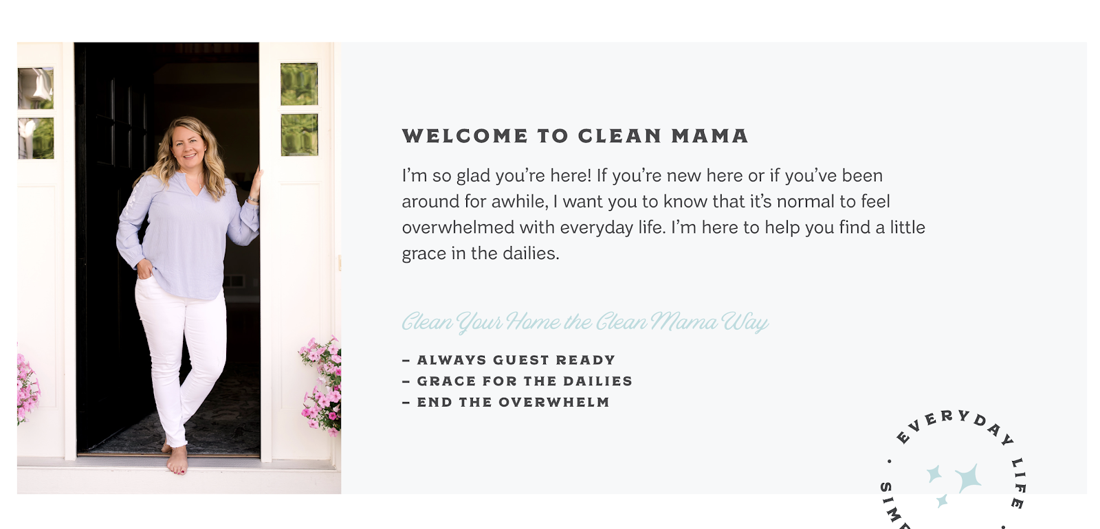
First, she welcomes her readers and explains three ways her blog is going to help them right off the bat:
- She’ll help you make your house ready for guests
- She’ll help you find some grace even in the things you have to do every day
- She’ll help you not feel so overwhelmed by your house chores
That’s expanded upon in a little mini-manifesto right here:
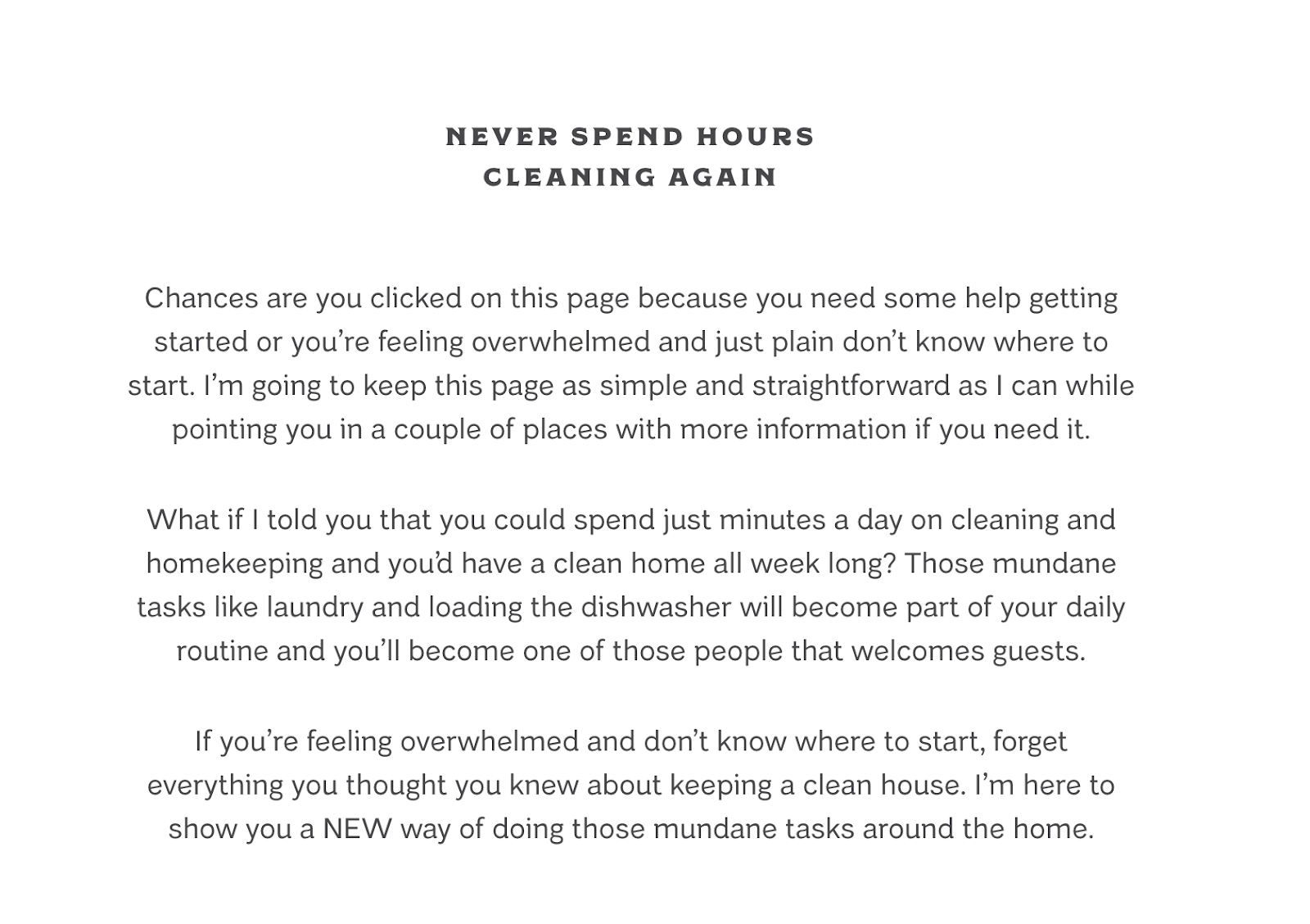
The next section she includes elaborates on the idea of feeling overwhelmed—and affirms that she has solutions to help. Anyone reading this far will likely be pretty hooked on her methodologies.
She then goes on to explain some of her strategies for keeping your house clean without spending hours doing it (offering up tons of free value to new readers).
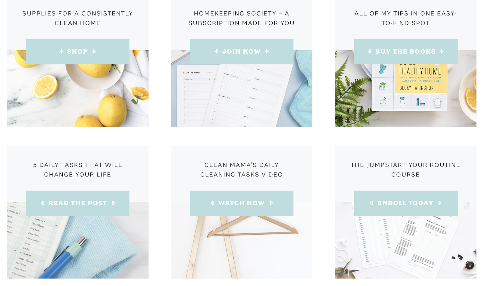
Finally, she includes some helpful links (and clear next steps for visitors), like a shopping link and a round-up of her best cleaning tips.
Using a “Start Here” page can be a very useful tool for organizing your content and easily directing your readers where you want them to go.
Tip #3: Create a Learning Center
If you’ve already created a decent amount of content, a learning center—or detailed resource page like my “Everything about blogging” page—is another way to organize it.
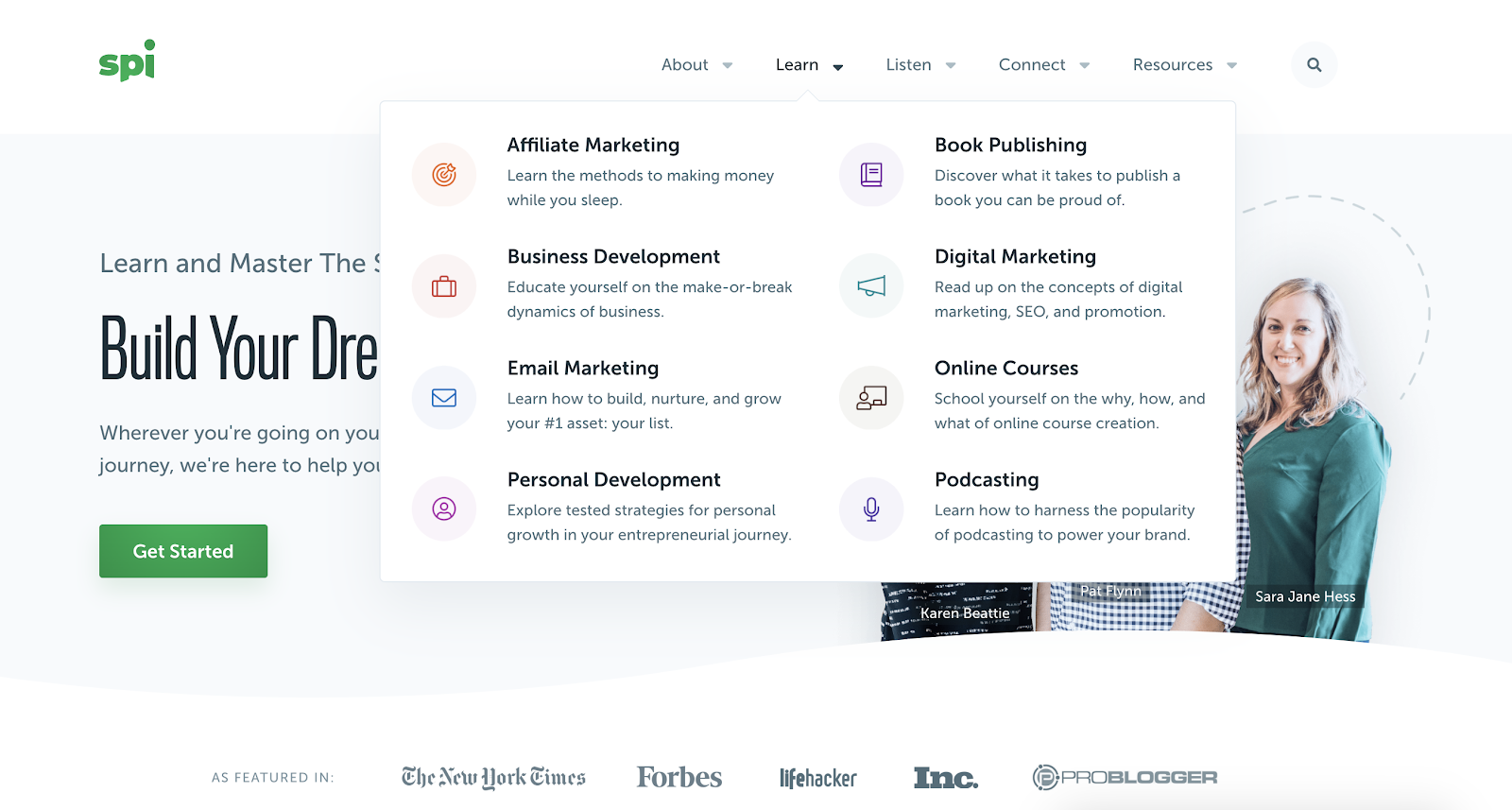
A learning center is a collection of categories arranged in one section (or drop-down menu). The idea is for readers to quickly find answers to common questions on your blog. Learning centers are often arranged by media types like videos, blog posts, and podcasts, as well as by general topics.
Smart Passive Income is a blog run by personal finance blogger Pat Flynn for aspiring online entrepreneurs. They use a very well-designed drop-down menu featuring a learning center for easier access to common topics they cover on the blog. Some of the topics they list include:
- Affiliate Marketing
- Business Development
- Digital Marketing
- Podcasting (here are my picks for the best podcast hosting if you’re considering starting a podcast)
- Book Publishing (or writing an eBook)
- Online Courses
- Email Marketing
All of these topics fit under the umbrella of online entrepreneurship, but each one is a bit more specific. You may have landed on their blog to learn more about affiliate marketing, and they’ve made it easier for you to access that information.
If you click on the affiliate marketing menu item, it navigates you to a curated landing page that breaks down all of their top resources on the subject:
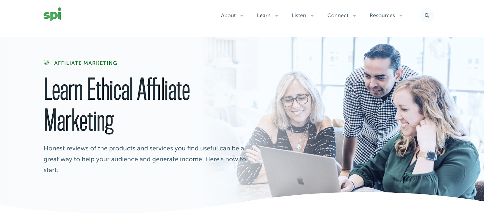
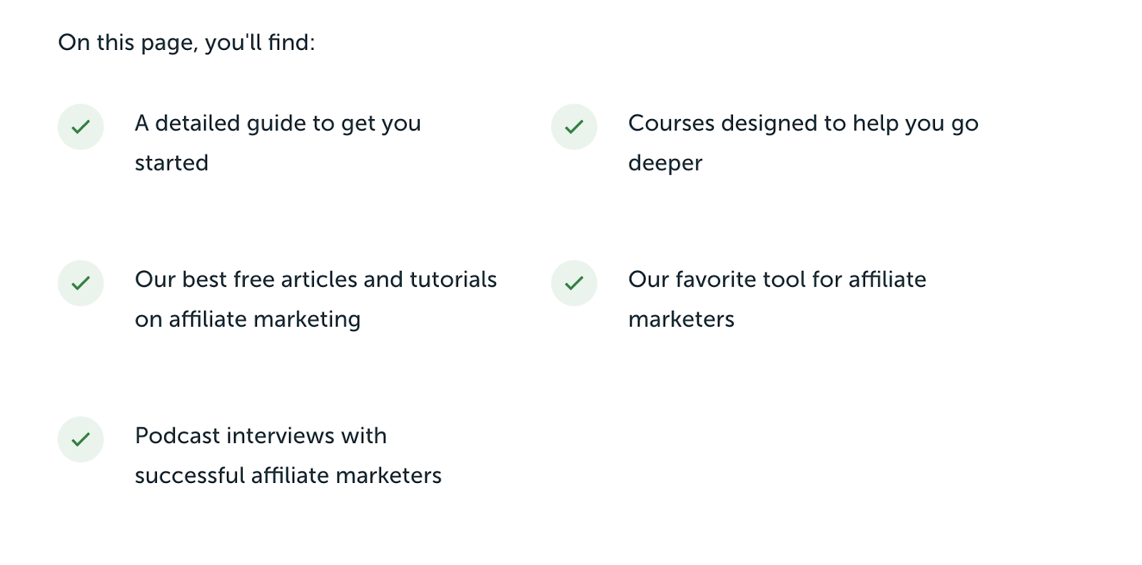
Here, you can find a variety of helpful information about affiliate marketing, including how to find and join the best affiliate programs for bloggers. They link to their best guides to affiliate marketing, courses they’ve created, additional articles, tools, and podcast episodes related to the subject. All of this is put on one single page for easy access to readers.
A learning center is best suited for a blog that already offers a lot of information but wants to provide quick, easy access to specific categories that readers are already coming to your site for. In that context, it really adds a lot of value to your blog layout in terms of creating a more reader-friendly experience.
3. Design Your Blog Posts to be Easily Scannable
Like it or not, writing on the Internet is very different from most other writing styles.

It’s very different from verbose academic writing or published books. When people read on the Internet, they (most often) want blog posts that are easy to scan and quickly digest the key points they’re searching for answers about.
That’s not to say people are unwilling to read long blog posts. Most people will read long-form articles from start to finish if they’re highly engaged in the subject matter. However, many people want to scan blog headlines to first determine if they want to read the article (or think they’ll be able to find answers to specific questions they have)—and often extend that scanning practice into how they read the content too.
Need Catchy Blog Title Ideas?
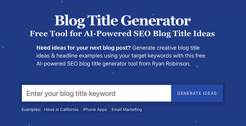
Try my free AI-Powered Blog Title Generator Tool to get dozens of SEO-friendly headline ideas to make your blog posts stand out today.
I go into this in much greater depth in my guide about how to write a blog post outline, but here are some quick tips for formatting your blog posts:
- Write short sections
- Avoid big blocks of text
- Break up text with images and headers
- Organize sections by headers and sub-headers
- Use bullet points or numbers to break up long sections of text
Let’s use this blog post as an example. Suppose I have a reader who came to my blog looking for a very specific answer. Maybe they wanted to know what size font I would recommend for their blog layout.
My headers should make it very easy for the reader to scan the blog post and find the answer quickly. Plus, there’s a navigational table of contents running along the right side of this article (when viewing on a desktop).
For long blog posts, you can make it even easier by making a WordPress table of contents at the beginning of your blog post layouts—as I’ve done at the top here (and have a more stylized version for my guide about starting a blog too).
Navigation is more important, the longer your blog content gets—so if you’re creating long-form content (like I do here on my blog), then you’ll want to go out of your way to make sure readers can quickly jump around throughout an article to more easily find what they’re looking for.
4. Utilize High-Quality Images (or Graphics)
Another mark of a great blog layout and design is high-quality images and graphics.
If you’ve visited a site that has low-resolution images, or poorly made graphics, you know this can be a turn-off (or can lead you not to trust the site).
If you’re not already convinced of the benefit of using quality images on your blog, here are some blogging statistics that might persuade you:
- A blog post with an image gets 94% more views.
- According to online marketing influencer Jeff Bullas, “In an online store, customers think that the quality of a product’s image is more important than product-specific information (63%), a long description (54%), and ratings and reviews (53%).” Take, for example, my roundup of Bluehost reviews.
- When people hear information, they generally remember 10% of the information when asked three days later. If an image is paired with the same information, people can retain 65% of the information after three days.
- Just 3% of bloggers add 10+ images per article, but they are 2.5x more likely to report “strong results” than the average blogger. This statistic is a little harder to decode, but it essentially says that bloggers who post 10+ images per post see better results than those with fewer images. It may not be natural to fit 10 images into a short blog post, but it’s suggesting that more images make your overall blog layout more appealing.
This isn’t to say that high-quality text (written content) is meaningless—that’s far from true. Blogging is still largely about what it’s always been—and that’s still primarily the written word because search engines like Google still “read” content through text.
What these statistics do mean, however, is that your images matter as well—and high-quality images & graphics will make your blog layout that much more appealing, more shareable, and more memorable to your readers.
Let’s look at the famous blog Humans of New York. HONY’s stories are compelling because of the written text and the visual images. One without the other would not have the same lasting impact.
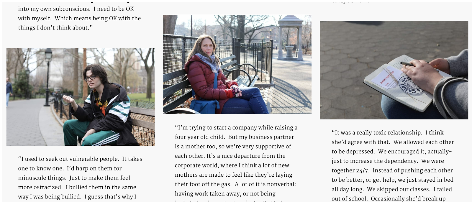
Think of your images and graphics as an integral part of your story. The higher the quality, the better the impression they’ll make on your blog readers.
5. Consider Page Load Time
Load time is another important consideration when designing your blog. That’s where Google PageSpeed optimization comes into play.
As we discussed, including visuals in your blog layout is extremely important. However, if your images, clunky WordPress plugins, or other slow-loading content are clogging up your load time, that’s a potentially big problem.
The truth is we’re pretty impatient—people won’t wait very long for a page to load. They may think your site isn’t working properly, or they may not care enough to wait more than a couple of seconds. Here are some statistics that show the real need for fast page load times:
- 53% of your visitors will leave your site if it takes more than 3 seconds to load
- A one-second page response delay reduces conversion by 7% (read this guide for more on designing your website with conversion rates in mind)
- Websites with a 1-3 second load time have a much lower bounce rate probability than those with a longer load time
Another good reason to keep your load time in check is your blog’s overall SEO profile. Load time is one of the key factors that Google uses to determine its search engine results rankings. The faster load time your blog has, the better chance it has of ranking high in organic search results. For example, if you’re an eCommerce company and it takes a lot of time for your page to load, users will leave your site long before completing a purchase. Consider investing in a headless eCommerce platform, which can dramatically speed up the load time on your site.
So, how do you ensure that your pages load quickly? Here are some easy ways to optimize your load time.
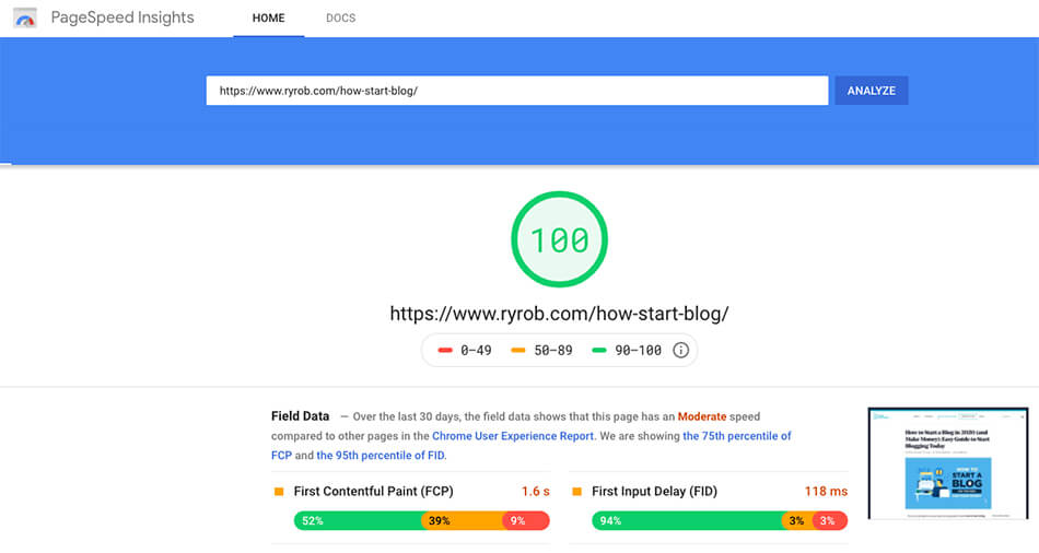
Test Your Page Load Speed
The first step in determining which changes need to be made to your blog layout is discovering your current load speed. You can use a free testing tool like Google’s PageSpeed Insights to gather these figures:
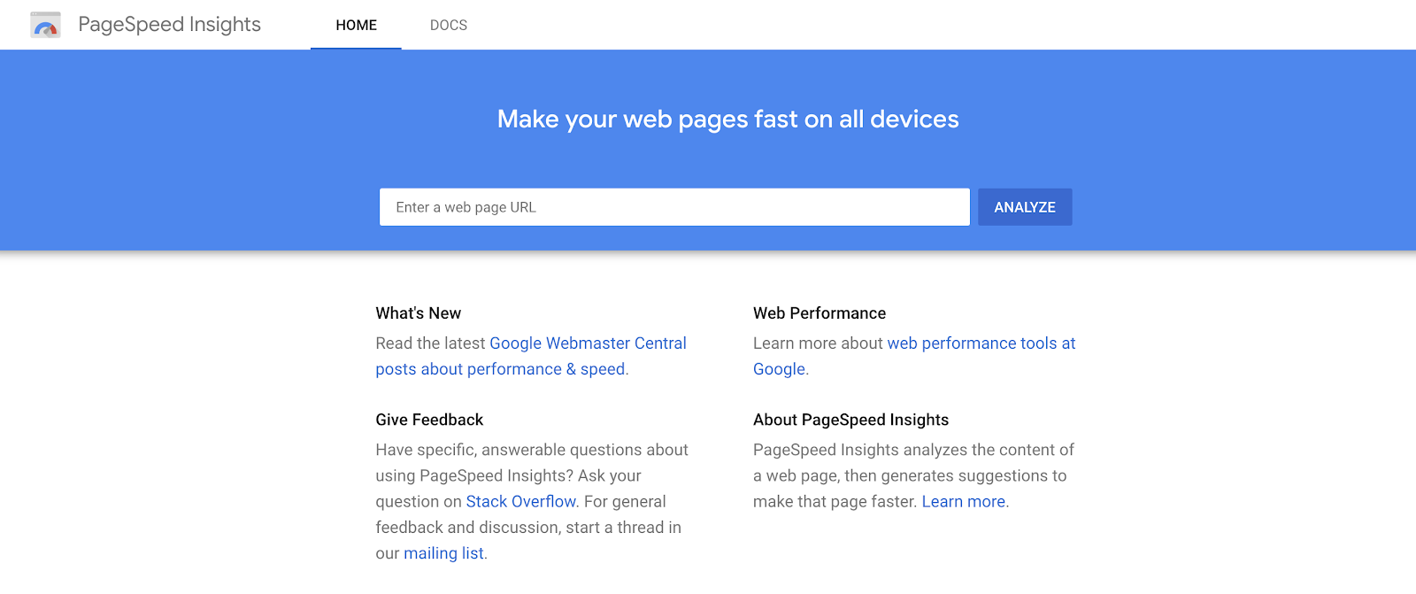
After running a test with the Google PageSpeed Insights tool, you’ll get a list of actionable suggestions on where you can trim down your page load speed.
Remove Unnecessary Plugins
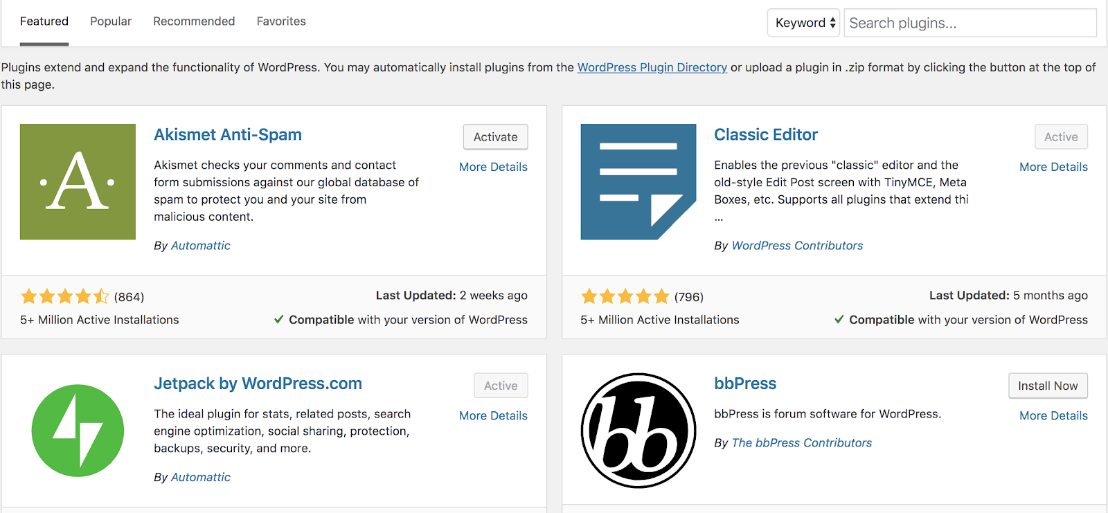
If you’re using WordPress for your self-hosted blog, then you’re probably familiar with plugins.
Plugins are extremely useful tools that help you do more with your blog—and there are many plugins I couldn’t live without. The downside of (some) plugins, though, is that they can contribute to slower load times if they inject a lot of code into your site to perform the additional functionality you want.
One way to combat this is to get rid of plugins that are redundant or no longer useful to your blog’s core functions. You may have installed several plugins that do the same job without realizing it. If there are plugins that no longer help grow your blog or better monetize your content, then take some time to consider which plugins you can get by without.
Choose a Faster Hosting Plan
Your blog’s hosting plan can make a big difference regarding the load time of your pages and posts. It may be tempting to pick from the absolute cheapest hosting plans when you’re just starting on a tight budget—and that’s ok for a while—but they often aren’t the best choice as your blog grows in time. You’ll want to upgrade to one of these managed WordPress hosting plans once your budget permits.
You can learn a lot more about hosting from my guide to shared hosting and in my Q&A about how much does web hosting cost?—but when it comes to hosting recommendations, my top three are:
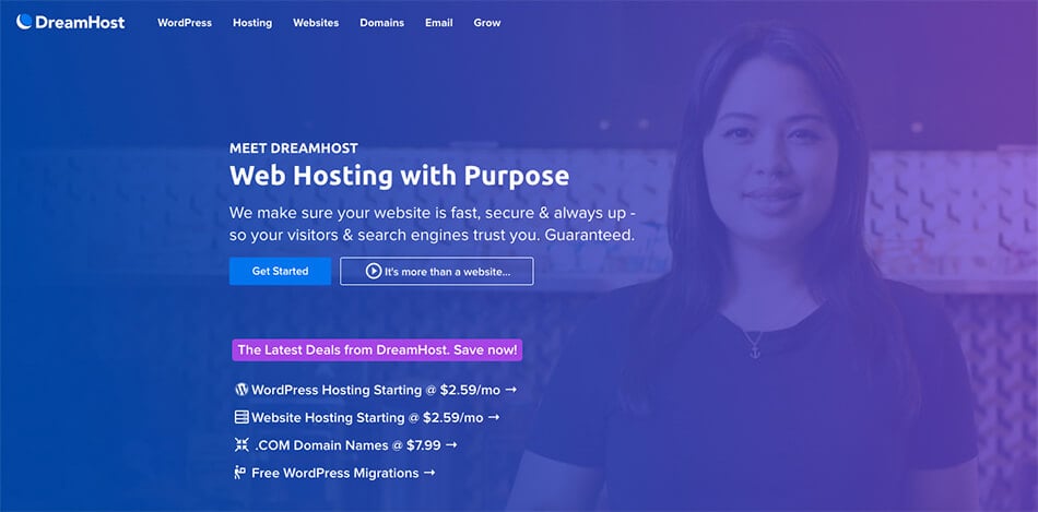
- Dreamhost (and their fast $2.59/mo plan)
- Bluehost (and their quick $3.99/mo choice plus plan)
- SiteGround (and their GrowBig $4.99/mo plan)
All three of these recommendations perform well on independent speed tests, but Dreamhost usually tests the fastest in terms of average page load speed (and they’re the most budget-friendly too). Each of these hosting companies offer affordable plans for bloggers, packed with a lot of features so you can’t go wrong when signing up with one—and I’ve used all three over the years.
Choose a More Minimalist Blog Layout (or WordPress Theme)
One of the reasons I keep my own blog layout and design so simple is to reduce the page load time it takes for readers to load my content.
You may not want to keep things quite as minimalist as I do here, but you can help your blog layout a lot in load speed by choosing a WordPress theme that won’t slow your site down much.
The three WordPress themes I recommend that run very quickly and have only a light amount of code loading in their default settings include:
- GeneratePress Pro WordPress Theme: I now use a customized version of this ultra-fast, lightweight theme here on my blog today (it’s what I redesigned my website with), and they offer a free version to start with.
- Astra WordPress Theme: This great (also free) theme is just about as minimalist and quick as GeneratePress and also has a Pro version you can eventually upgrade to once you need additional functionality.
- Elementor Page Builder: If you want a WordPress theme with a visual page builder (which I used for many years), the only one worth considering today—from a page load speed perspective—is Elementor and their Hello Theme, which pairs very nicely with it.
Installing the Best WordPress Performance Plugins
Even after choosing a lightweight WordPress theme to power your blog, you can get a lot of extra speed and optimization gains out of installing the right performance plugins. Unfortunately, you’ll have to buy a performance plugin for your blog, as there just aren’t any truly beneficial free options out there (that don’t have drawbacks outweighing their benefits).
I use both of these performance plugins on my blog today, and they’re all you’ll need:
- Perfmatters ($24.95/year): This is by far my favorite performance plugin because it’s been built specifically with the overarching goal of being as lightweight, fast, and intuitive as possible. To that end, they’ve done an excellent job. After installing it here on my blog and using their default configurations, I saw an immediate speed boost in my page load times—and there’s a lot you can tinker with to get more gains. Plus, they offer a 30-day money-back guarantee if you decide the plugin isn’t impacting your speed as much as you’d hoped.
- WP Rocket ($59/year): As a nice complement to Perfmatters, WP Rocket comes into play as a great caching tool (which creates much faster load times) and does a fantastic job of optimizing and reducing the weight of the HTML, CSS, and JS files your blog loads each time a reader hits a page. WP Rocket also offers a no-questions-asked money-back guarantee—just be sure to reach out within 14 days of your purchase if things aren’t going according to plan, and they’ll refund you.
There are a lot more things you can do to slim down your blog layout’s page load time (the subject for a later date), but putting these simple best practices and tools into place—is a great foundation. Keep these kinds of factors in mind, too, if you’re considering buying a blog that’s already been around the block.
6. Include Compelling CTAs (Calls to Action)
You’ve probably heard it before, but if you’re not totally familiar with the term, let me explain what a call to action really is.
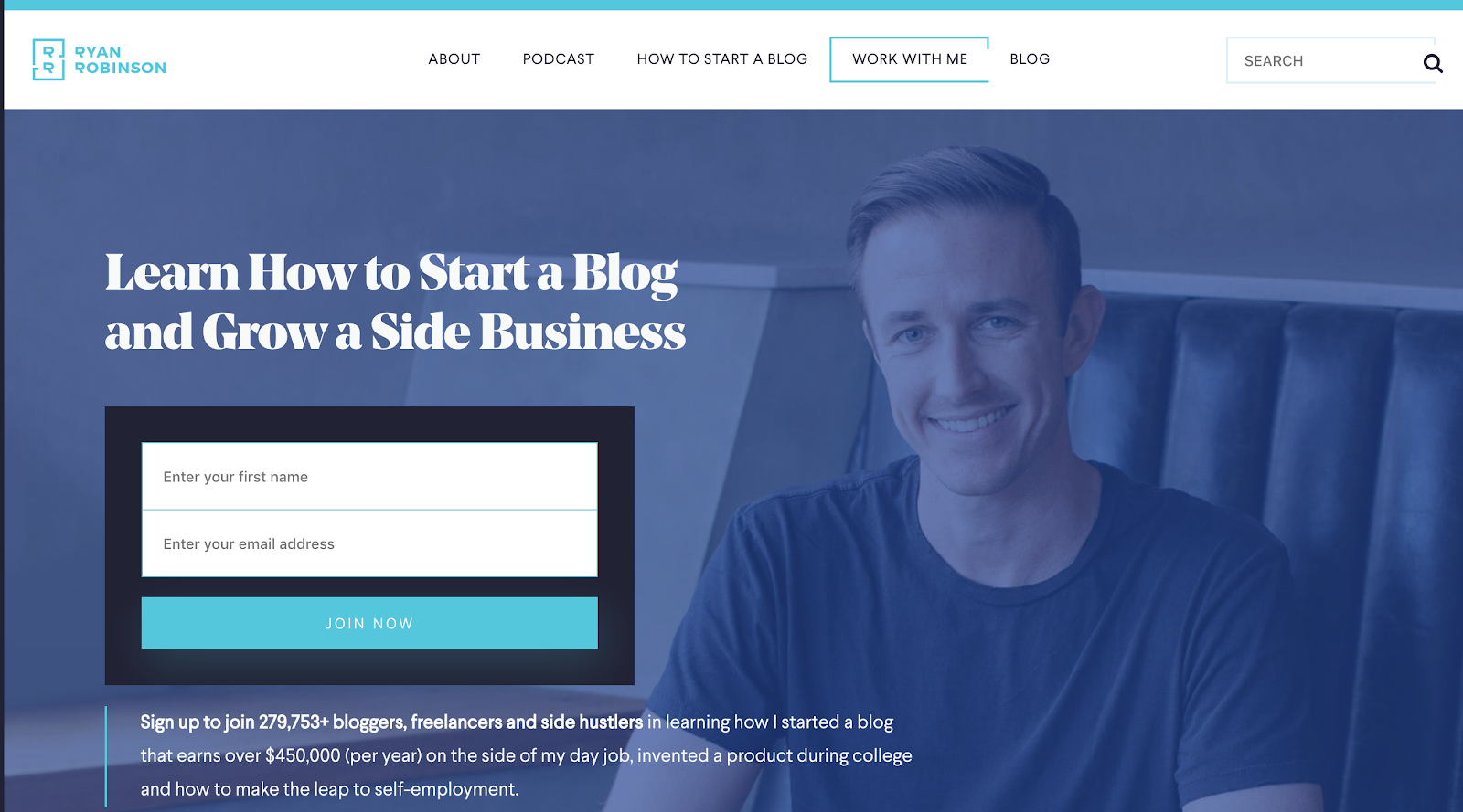
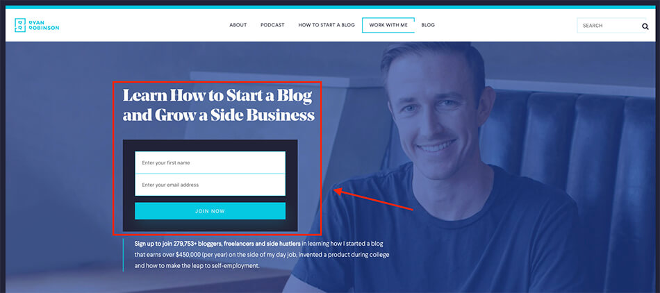
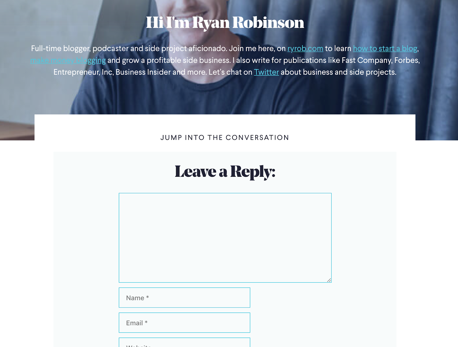
See this big header and form near the top of my homepage? That’s a call to action—and it’s asking readers to join my email list (if they’re interested in learning how to start a blog and grow a side business):
Suppose you’ve started a blog about protecting marine life. We’ll imagine you’ve written a stellar blog post about the beauty of whales, their importance in the ecosystem and the dangers they face today.
As people read that blog post, what do you want them to do? What action are you hoping they’ll take next?
Here are some potential actions you’ll likely hope your reader will take:
- Donate money to save the whales
- Sign up for your newsletter
- Go to other important articles on your blog for further reading
So, how do you drive more readers toward an intended outcome with your blog layout? To help direct people, you need to frequently employ what’s known as a “Call to Action.” If you haven’t included a call to action within your blog post yet, many people will read it, leave your page and give it very little thought later.
It’s not that readers don’t care about whales; it’s that they weren’t given anything tangible to do next. You’ve alerted them to a problem, but you haven’t offered them any solutions.
It’s your job to make it super simple to help whales. Your first step as a blogger is to expose an issue, and the next is to offer really easy solutions to help with that problem.
Here’s how you can include CTAs that help further your cause:
- Solution 1: Donate to organizations that help whales. Include links to several organizations that you support. Show people exactly which organizations you recommend cutting down on their research time. They don’t have to spend additional time searching for reputable places to donate when you’ve presented them with organizations on your page.
- Solution 2: Join your email list. Tell your blog’s visitors that they can learn more about helping sea creatures by signing up for your email newsletter. The more they hear about sea animals, the more likely they will want to help—plus, you can give more clear directions on how to support the right organizations over email too.
- Solution 3: Include links to other blog posts you’ve written. Another way you can use a CTA, is to include links to other blog posts you’ve written. Maybe one of the things you mentioned in your article about whales is the danger of plastic pollution. You can include a link to another article you’ve written about how to reduce plastic waste.
Now, let’s look at a real-life example. The Wilderness Society is an organization that strives to protect public wildernesses in the United States. Check out this large call to action (to read a message from their president) right on the homepage:
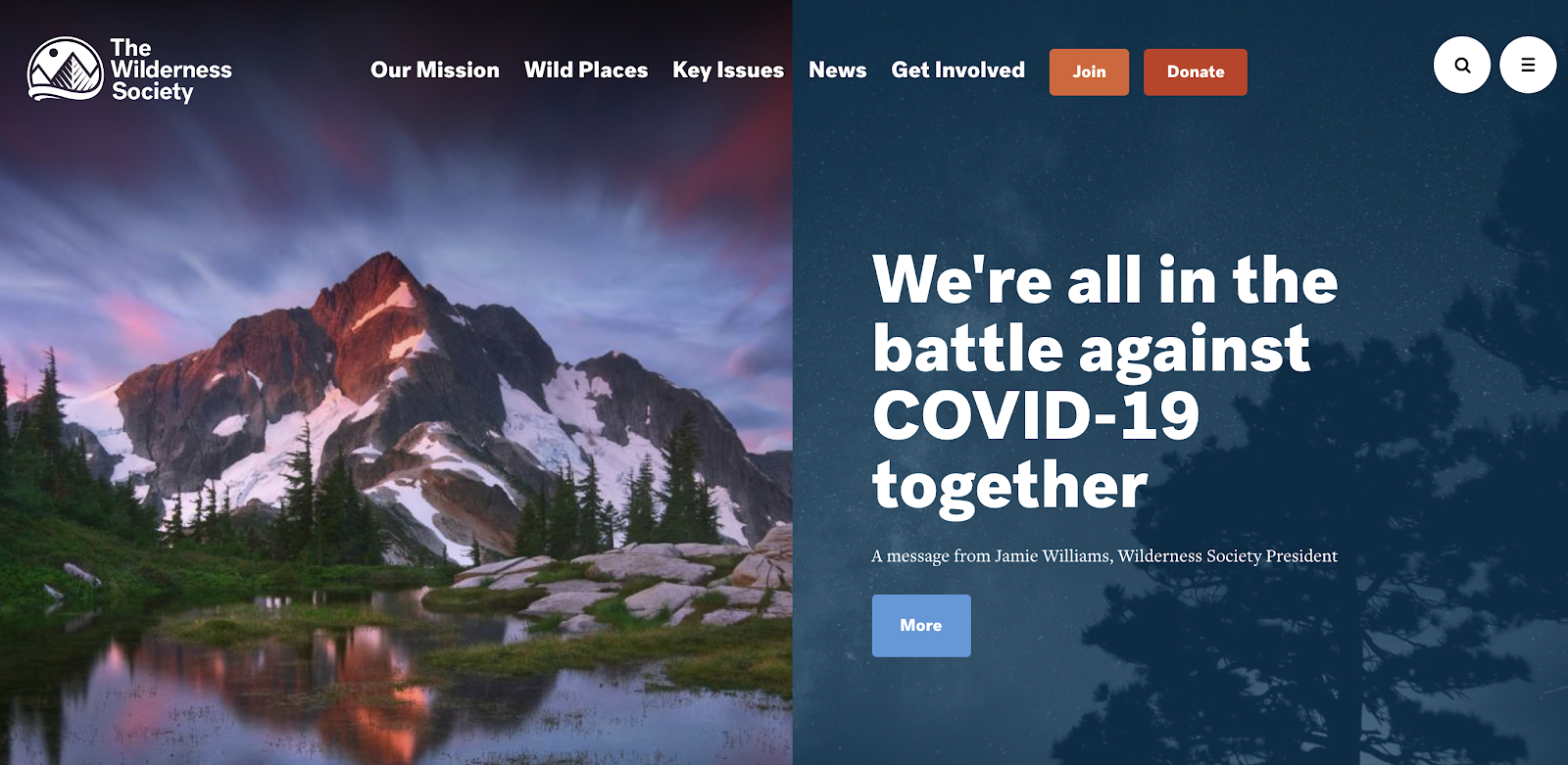
Here’s how they’ve included CTAs within their top-level menu that’s loaded across all the pages on their site:
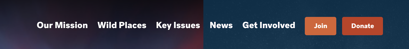
At the top of their pages within their menu, they include several ways to get involved with the protection of wild lands:
- Key Issues
- News
- Get Involved
- Join
- Donate
These links are easy to access and answer the most fundamental questions behind their mission. The “join” and “donate” buttons are easy to identify and understand.
They also include CTAs directly within their blog posts. For example, in the middle of one post, they included a link to an article with more information on a similar, closely related topic.
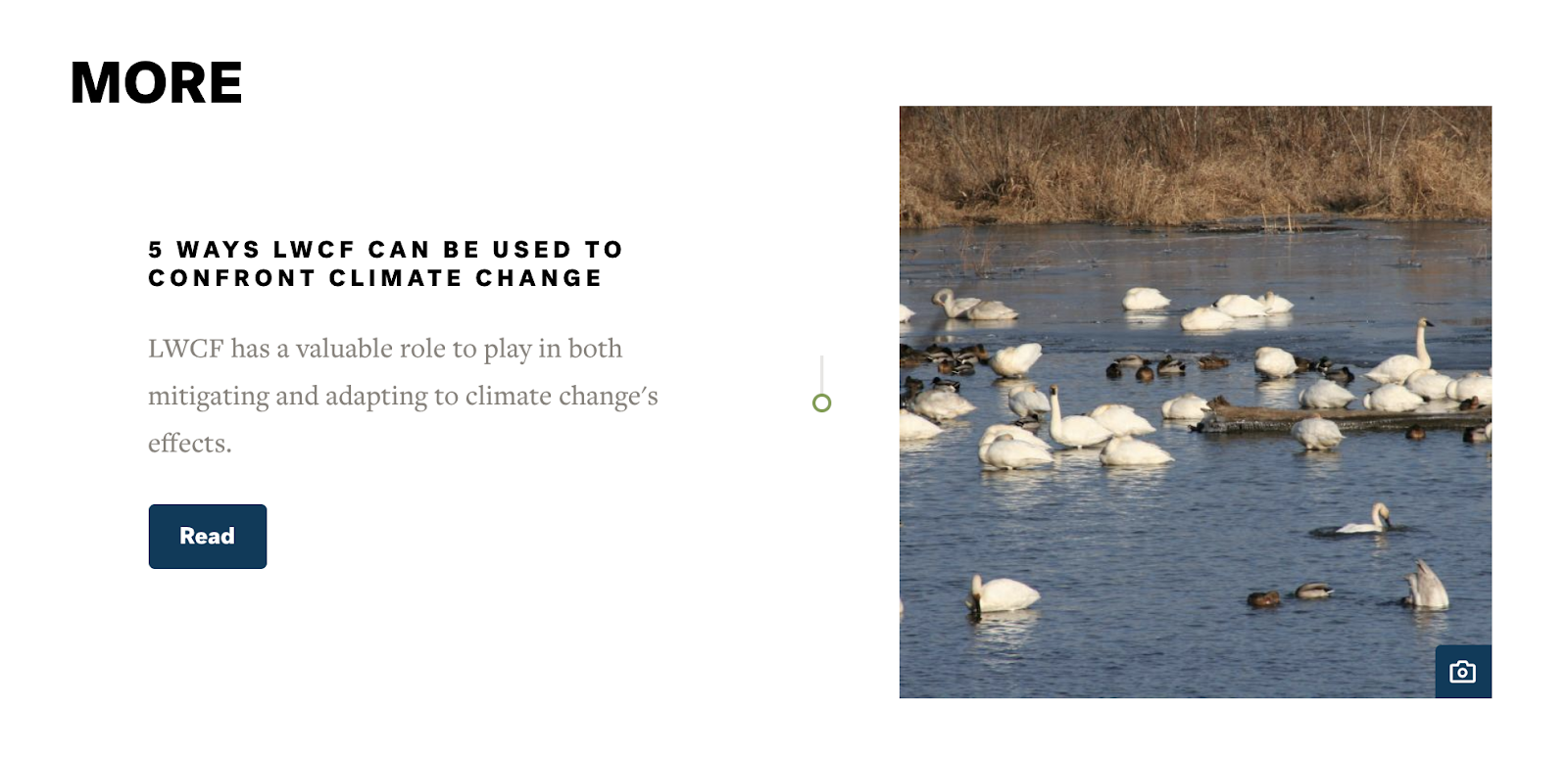
At the end of the article, they include links to additional articles related to caring for wild lands, followed by an easy way to sign up for their newsletter:
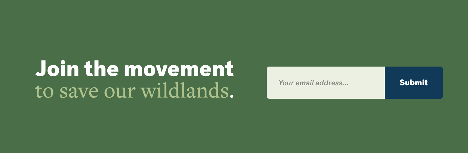
Each one of these CTAs helps further their blogging goals—and makes it much easier for readers actually to do something with the information they’re reading.
7. The Fine Line Between Creative and Cluttered
Not every blog layout or design needs to be as minimalistic as mine. Here, we’re going to review a few alternative blog layouts that are very diverse in their design decisions, illustrating that you can be extremely creative without forfeiting ease of use and functionality.
However, it should be known that there’s a very fine line between creativity and chaos. If your blog readers can’t find your content easily (or feel instantly overwhelmed by the amount of things going on with your blog layout), your site isn’t functioning at its highest potential.
Here are a few specific elements that can distract your readers from consuming your content:
Too Many Ads
Having well-placed advertisements on your blog can be a great way to increase your blog revenue. On the other hand, a blog that’s lit up with ads blinking in the header, footer, sidebar, and in the middle of your content—can be extremely distracting. I can tell you that I’ve personally left many blogs without reading a word of content for this exact reason, and it’s a major reason why I removed ads from my own blog this year.
People are coming to your blog primarily to solve a problem they have by searching for answers in your content. If there are too many ads muddling up your articles, you run the risk of looking like a spam site that’s hiding answers from readers for just long enough to get some extra ad impressions instead of being a genuinely useful, reputable source of information.
A Messy Sidebar
There are certainly pros and cons to using your blog sidebar. Some people recommend not having one at all, while others say that it can be very helpful for navigation and tastefully promote your blog content.
I tend to fall on the side of not utilizing much of a sidebar (aside from a table of contents with particularly lengthy articles), and I intentionally left it out of my new blog’s recent redesign. If you do choose to include a sidebar, though, try to keep it as clean, simple, and useful as possible.
Try to include only the most vital information that you want readers to know about and take action on. For everything else, just put it in the footer.
No Use of Negative Space
Earlier, we talked about how I thoughtfully utilize white space on my blog layout. Some bloggers need text or images covering every inch of real estate on their blogs. My advice is not to be afraid of leaving some comfortable spacing throughout your blog layout, as it can often be more calming to readers than a design that’s jam-packed with elements.
Negative space also allows people to locate important information on your blog more easily. It allows you to highlight the most essential features (or articles) on your blog.
What a Clean Blog Layout Looks Like
Now, let’s look at a few real examples of blog layouts that have done an amazing job of designing a unique yet very clean and easy-to-use look.
Maptia is a travel and storytelling blog with a mission to help people learn more about the world and develop empathy for people in other places and cultures. Here’s a look at their blog layout directly on the homepage:
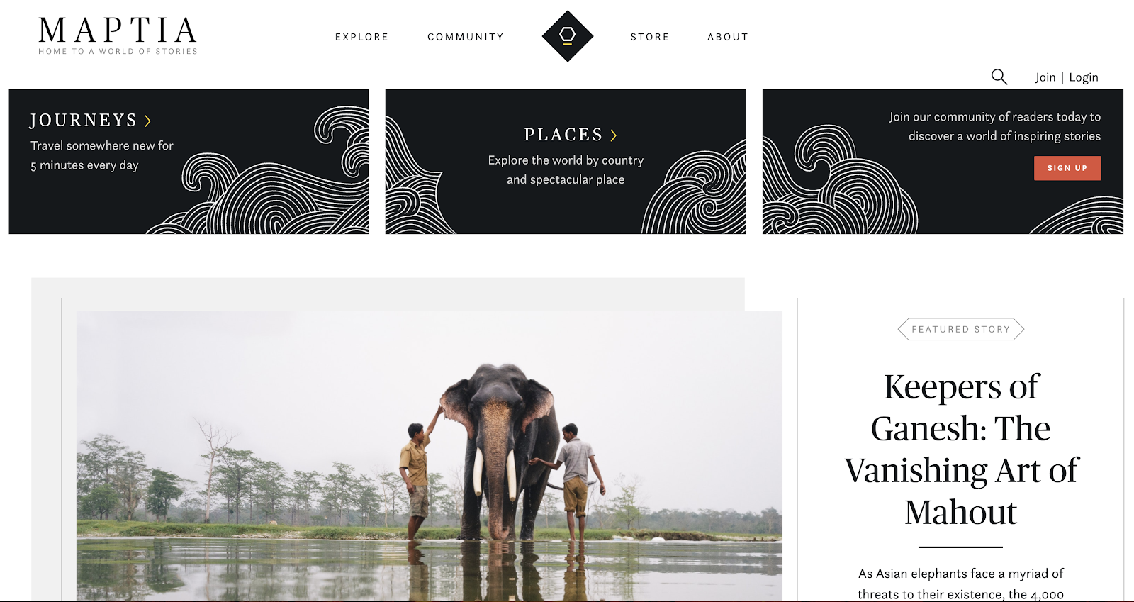
At the top of their pages, they have a few key links followed by a visually interesting and well-designed header with three additional CTAs that are all relevant to their target readers.
Below that, they have a featured story; notice all the negative space around these items. I’d also point out their use of easy-to-read font and large, high-quality images.
If you can’t tell, I really love their blog layout, especially for the travel blogging and storytelling niche.
Here’s another beautiful, creative, and simple blog layout example from a travel blog called Rojo Cangrejo. At the top of their blog, there’s a huge sliding image with links. Even though the whole top of the page is covered, the text is still easy to read (the white text on the large image is easy to see, too):
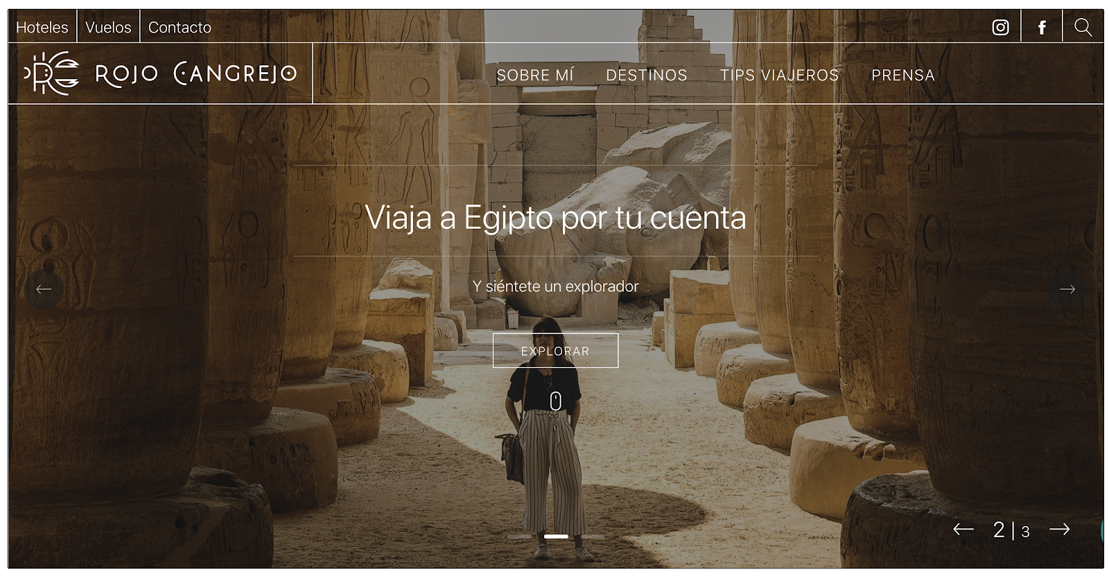
If you scroll down, you can see that they also use a great deal of white space.
They also continue to use negative space for additional story links toward the bottom of their pages, which makes for a very nice and cohesive experience for readers.
Both of these blog layouts are unique, but they do a fantastic job of keeping their content accessible and visually appealing—which is no easy feat.
8. Encourage Engagement
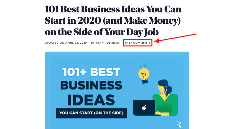
Engagement is king when it comes to Internet content. This is true both on social media and with blogging. As you can see across my blog here, I have many articles that have several hundred comments (and a few with over 1,000+ comments, like my roundup of the best business ideas to pursue this year):
There are tons of guides about achieving greater engagement in order to better promote your blog, but in this post we’re examining this from a blog layout perspective. What can you do to encourage engagement as part of your own blog layout?
Here are a few ideas for making your target audience feel like they’re interacting with your content (and a part of the journey with you).
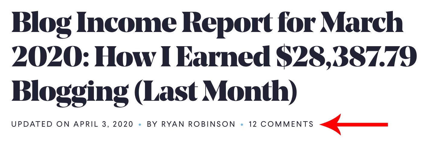
Show the Comment Count at the Top of Your Blog Post Layout
One of the best types of content for engagement as a blogger is comments on your blog posts. This is a perfect window into your visitors’ thoughts and an easy way to build a relationship with many of them. Plus, it helps establish more trust from readers who can also read your genuine replies in the comments section.
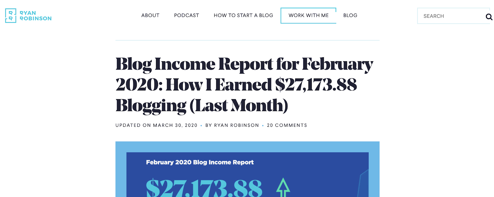
A great way to help readers become more interested in commenting is by showcasing a comment count at the beginning of your blog posts. The more comments people have left, the more others will want to read them and potentially submit one themselves. I use this method on my own blog, which you can see here on a recent blog income report:
Display a “Like” Button on Your Post
Another way to increase engagement on your blog posts is to display a like button—whether or not it’s actually connected to a social media platform like Facebook.
This is very reminiscent of social media, giving people a quick way to show that they like what you’ve written.
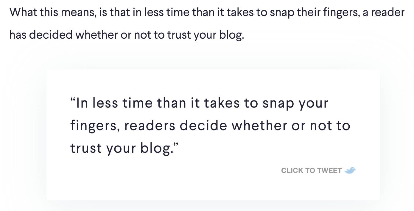
Include Social Media Share Buttons
Include social media share buttons to make it easy for your visitors to share your content. I like to use the Click to Tweet link generator so readers can lift specific quotes straight from my blog posts and share them right on their Twitter profiles (a social network where I discover and connect with many of my readers).
Ask Readers if the Content You’re Sharing Has Helped Them
A common way to increase engagement with your readers is by asking questions directly in your blog posts. Asking simple questions or opening an opportunity for them to ask questions is a great way to create conversations with more of your readers.
You can take this one step further and make it an integral part of your blog layout. Many online help centers include a button at the bottom of their content asking if an article was helpful.
Here’s an example from a Google tutorial:
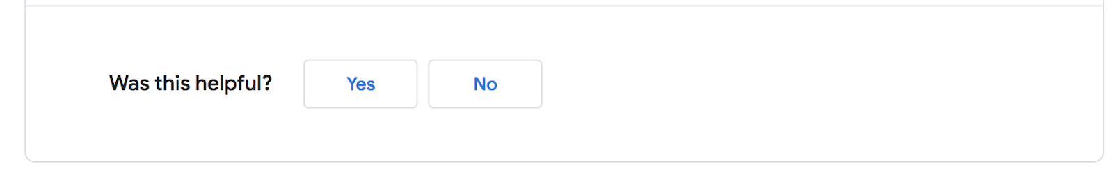
If you choose the no response, they’ll prompt you to say what wasn’t helpful about the experience:
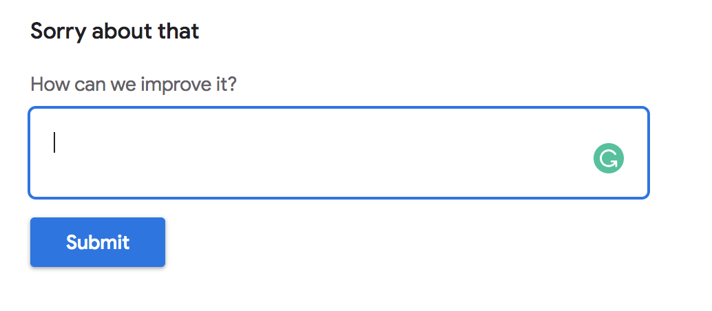
If you’re creating blog posts designed to help people with a specific task or answer a clear question, this could be a very savvy way to get immediate feedback on your content.
Ultimately, it starts a conversation that lets your readers tell you if something is helpful. Those who take the time to give you an answer will show you what may be lacking from your tutorial—and you’ll (hopefully) receive some praise there, too.
9. Brand Your Blog Layout
Your marketing 101 class will tell you that branding is crucial to creating lasting, long-term success. And it’s true: branding can help set you apart from the competition and make you more recognizable to your customers (and prospects) across many mediums and metrics.
When designing your blog layout, look for opportunities to brand your site as unique. Your entire blog should be cohesive, and each page (or post) should match the look and feel of the rest of your blog. For example, you wouldn’t want your homepage to be bland and then other pages to be vibrant technicolor. Stick to a theme that makes sense for you.
Now, let’s explore some of the ways that branding can improve your blog layout.
Define Your Message (and Personality)
You have a distinct personality, and so should your blog.
- What parts of you do you want to come out in your blog layout?
- Are you attracted to bright colors or monochromatic themes like this neon pink color from Colorkit?
- Are you a photographer wanting to use many images in your design?
- Maybe you’re a designer who could use your blog layout as an opportunity to showcase your graphics.
- If you’re a writer, take your layout to highlight your style and tone.
Think about what parts of you need to be included as a core feature of your blog layout, and carry that idea throughout your site’s design.
Choose Your Branding Colors
Color is a very tangible way to brand your blog and choose a specific mood for the site. For my blog, I use a few specific shades of blue here. This color scheme is carried throughout my blog and in the graphics I use for my blog post header images.
There are many theories about the use of color and how people interact with it, but I chose to lean on shares of blue largely out of personal preference for the color and the very cool, calm, relatable sense that I feel it conveys to my readers.
- Some people ascribe feelings to when they view certain colors.
- Some colors may put people at ease, while others may make them uncomfortable.
You can even look up color charts to determine what vibe you want your blog’s brand to exhibit. For example, green is often associated with growth and prosperity, while red is sometimes linked to energy and passion.
What matters most is how you implement the color you choose. Choose colors that complement each other and try to maintain a consistent color scheme throughout your blog layout so as not to confuse your regular readers. This will help you develop your branding strategy and become much more memorable over the long haul.
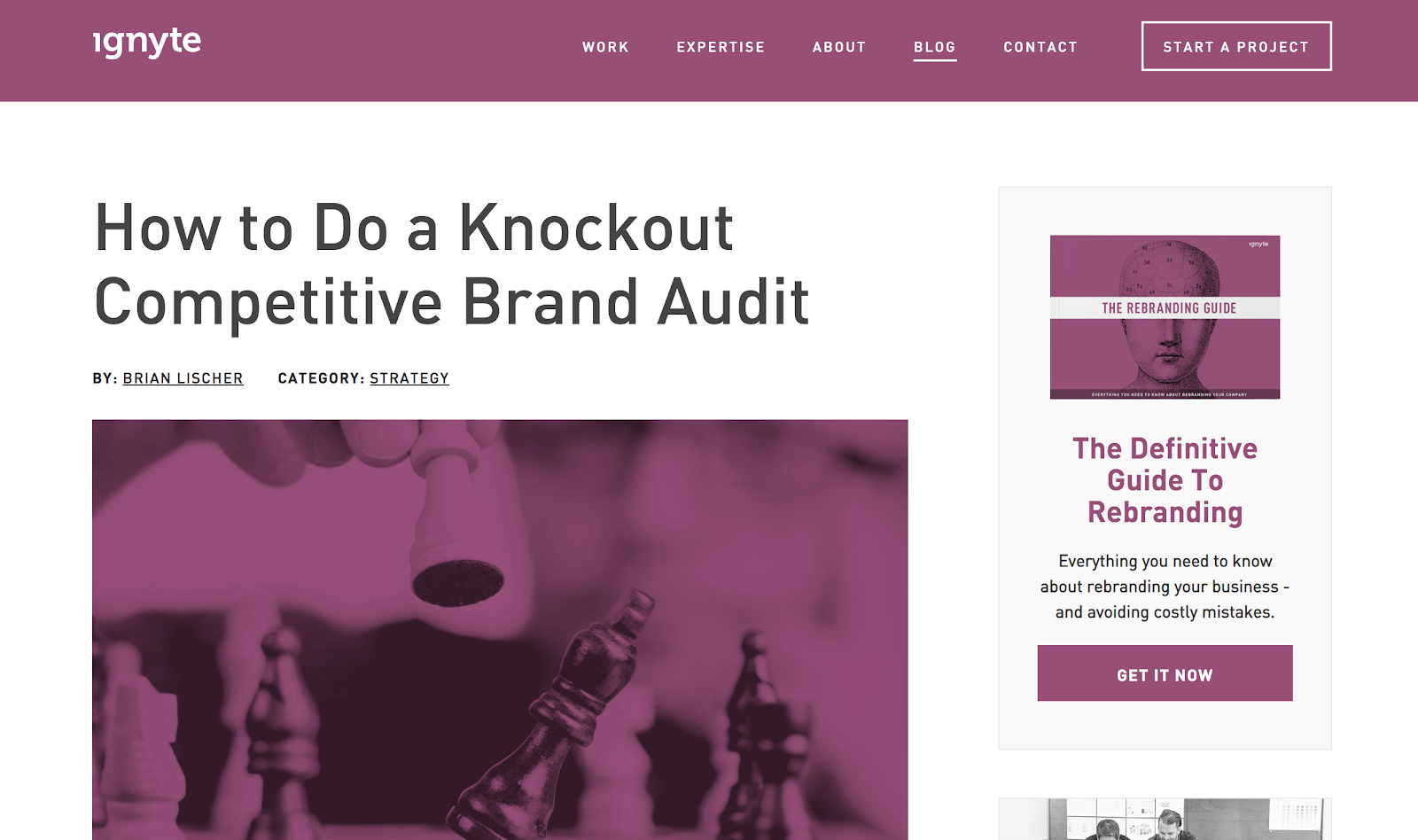
Ignyte is a marketing firm based out of San Diego, California. While the core function of their website is to drive new business (as all smart small business website designs should), they also have a blog component to their site. They use a shade of purple in a very unique way throughout their website. The results are pretty visually captivating:
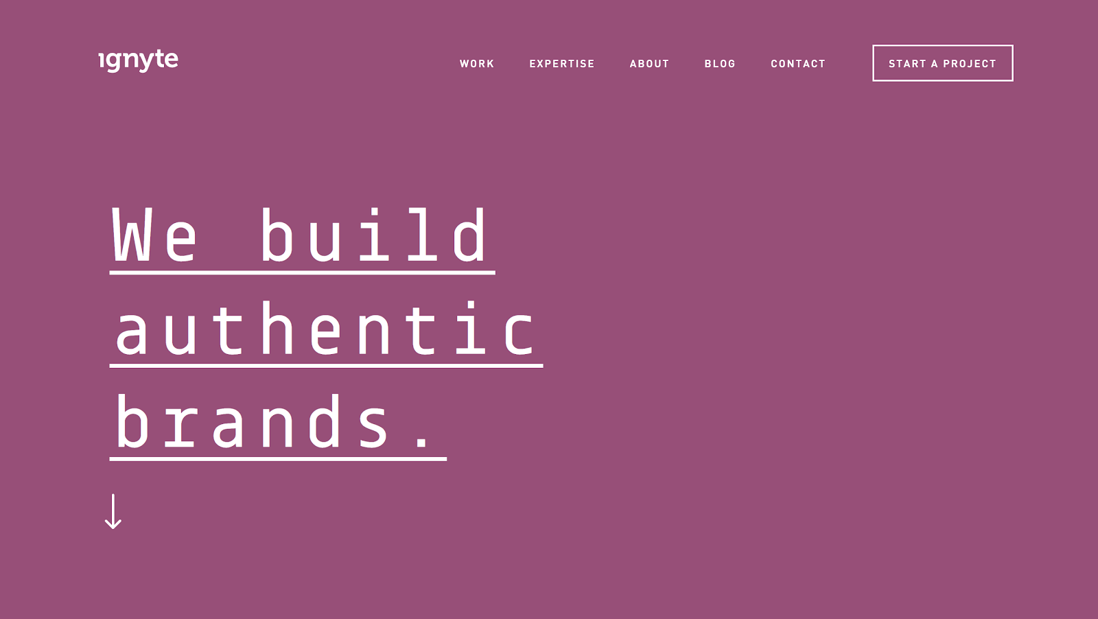
Though it’s an unusual choice on the surface, their use of purple for text and images is memorable and visually appealing.
Design a Captivating Logo for Your Blog
Logos are a part of our daily life without us even really noticing it. See mine in the top left corner of my blog menu?
Without looking it up, try to think of the Nike logo. Now think about Apple products, Coca-Cola, and Disney. We all roughly know what these logos look like and can imagine them instantly in our minds. Nike can brand a black T-shirt with nothing more than a tiny swoosh, and just about everyone who sees that shirt will know who made it.
You see the golden arches, and you’re already craving french fries and a burger. However, today, I would much rather channel that energy toward one of the best vegan burgers in LA.
That’s why a logo is so helpful in your branding strategy. You can place your logo across your content, and over time, readers will automatically identify it as yours.
Choose a Typography
We already discussed the importance of legible fonts for your blog, but once you’ve chosen your typography, use it consistently throughout your blog layout.
This is another way to ensure that you’re creating a brand and personality for your blog. There’s also the strategy of pairing fonts that work well together. If you use different fonts for your navigation menu, you want them to look good with the typography within the body text of your blog posts.
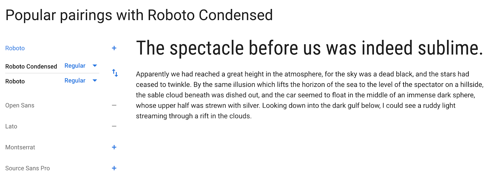
You can check out Google’s font page for an introduction to pairing fonts. Every time you select a font, it shows you all the styles it comes in and the fonts it pairs best with. This is what it looks like:
Some of your branding strategies will be influenced by the audience you’re trying to reach.
And since this is such a big part of your blog layout, I’ve dedicated my entire next best practice to making your blog layout specifically designed to appeal well to your target audience.
10. Make Your Blog Layout Relate to Your Audience
My final best practice for designing a winning blog layout is to make layout decisions with your audience in mind—because what appeals to one group of people may not be as relatable to another.
If you’re asking yourself… do people still read blogs? Well, the answer is a resounding yes. Now, let’s run through a couple of layout examples that show how you’d make design decisions based on the distinctly different audiences you want to attract.
The Blog Layout of a Fashion Site
The best way to explain the difference in layout structures is to show you real-life successful blog examples. Let’s look at a fashion blog first, which is an intensely visual space. While the style and feel of your text are important, the primary reason most people visit fashion blogs is to see fashion. That’s why it makes sense that fashion blogs are very image-dominant.
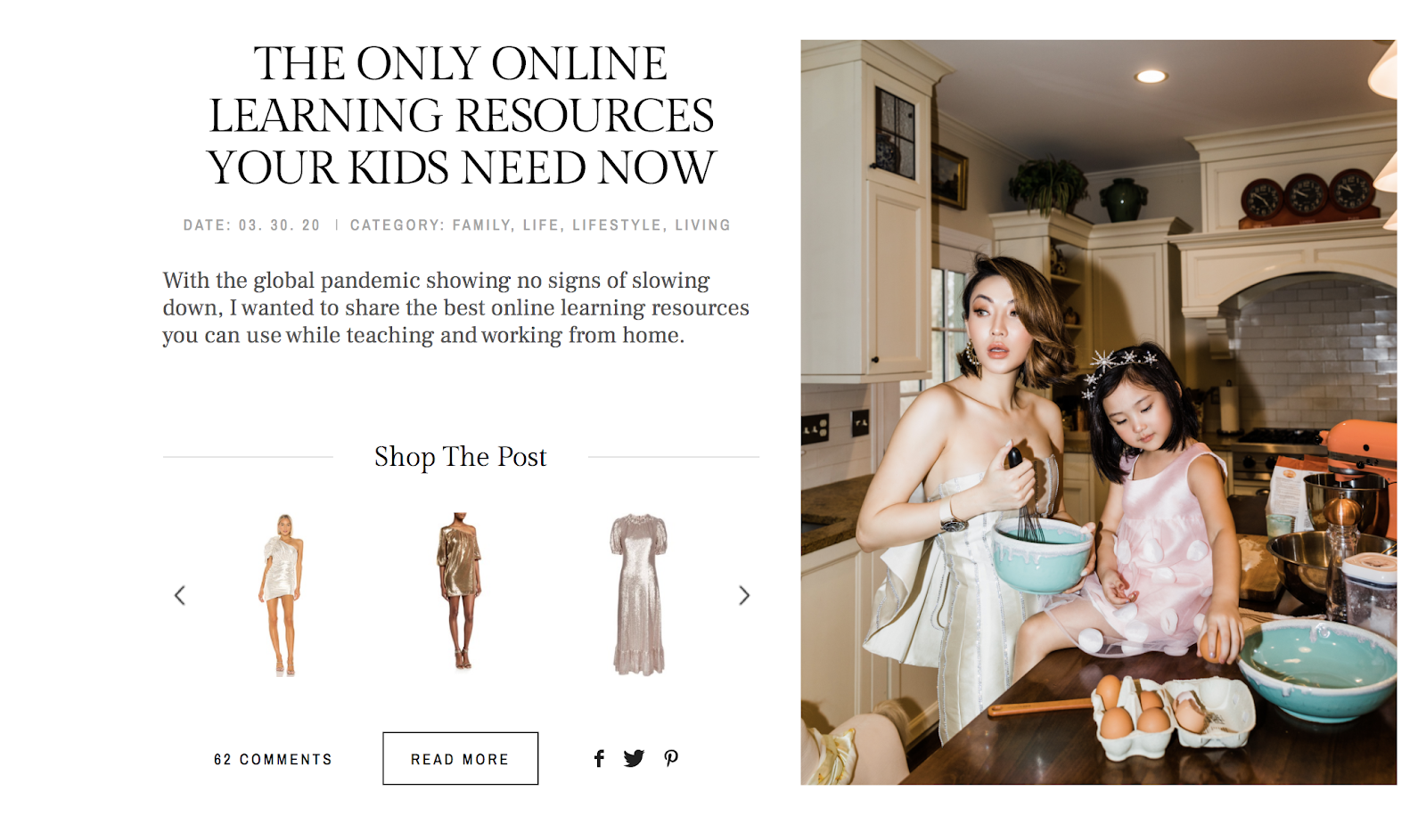
Not Jess Fashion is a fashion blog created by NYC digital influencer Jessica Wang. Her blog layout consists of a lot of full-size images and shoppable posts. Her writing is still an essential aspect of her blogging, but the images are what really tell the story.
Here’s one of her recent blog posts featuring a large right-aligned image and clear “shop the post” links next to the image and near the top of her article.
In her individual blog posts, she continues the trend of captivating, high-quality images intermixed with shorter areas of text.
For example, in her blog post How to Celebrate International Women’s Day, she includes stunning photos of her daughters to express the story of what it means to celebrate women and to help raise awareness of a global water shortage problem. This combination of features works very well for the types of readers Jessica wants to reach.
Now that we’ve talked about a fashion blog, how does it compare to another blog niche?
Let’s look at a dramatically different example to really showcase how diverse your blog layout can be—depending on the audience you want to attract (and retain).
The Blog Layout of a Finance Site
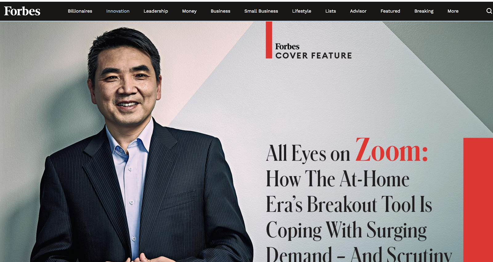
Veering far away from fashion, let’s look at another popular blogging niche: finance and business. This time, we’ll explore the distinguished publication Forbes. Like the fashion blog we highlighted above, Forbes often uses large, high-quality images at the tops of its feature stories, giving it a very magazine-esque look.
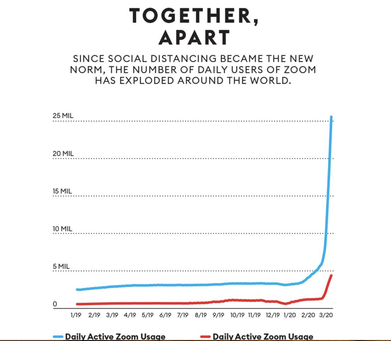
In addition to high-quality images, they also regularly include graphs (like this one about the increase of daily users on Zoom this year):
One major difference between the fashion blog and this article on Forbes is that this piece has much longer blocks of text. The images are also front-loaded, with heavier image use at the beginning of the article and fewer as you really dig into the core of the story.
In both examples, though, the text is centered on the page, but in Forbes, the text blocks are a bit more narrow. It looks more like a print magazine, and I follow this format in some ways on my own blog layout.
You can also notice a big difference in color schemes. Where Not Jess Fashion tends to use bright pastels and creams, Forbes generally uses a darker color scheme with a few pops of bold colors when they want something to be emphasized. You can use a color palette generator to get ideas for your own blog.
Which Blog Layout Style Should You Use?
If you’re brand new to blogging, you may not be totally familiar with the likes and dislikes of your audience. You may not even know your ideal audience yet (and that’s ok).
A good way to figure this out is to check out other blogs within your niche. Look through a dozen or so sites in your niche and notice what stands out about their blogs.
- Do they have an exciting color scheme?
- Do you love their graphics or imagery?
- Do they have an exceptionally user-friendly navigation menu?
- Does their blog layout feel bold or conservative?
To help jump-start your research, we’re going to dive into twelve blog layout examples below here now—showcasing several of my favorite blogs that have remarkable designs and clever layouts to give you some real inspiration. We’re going to walk through some very diverse blog layouts and styles that’ll show you how possible it is to tailor your blog to any audience.
Remember, though… this is not a one-size-fits-all recommendation because there are many different ways to create a successful blog layout based on variables like who your audience is and any design statements you personally want to make.
12 Blog Layout Examples to Learn From When Designing Your Blog
Now that we’ve established the best practices for designing a winning blog layout, let’s examine some of the best blog layouts on the Internet to see them in action.
1. The Intercept: Bold Blog Layout
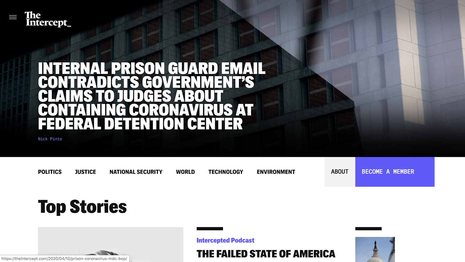
The Intercept is an online news source that investigates and analyzes topics related to politics, war, national security, technology, and the environment.
From a design standpoint, there are many things you can learn from them. Their font choices are large, bold, and easy to read. They also keep their blog layout very clean and use negative space to make their featured stories pop clearly.
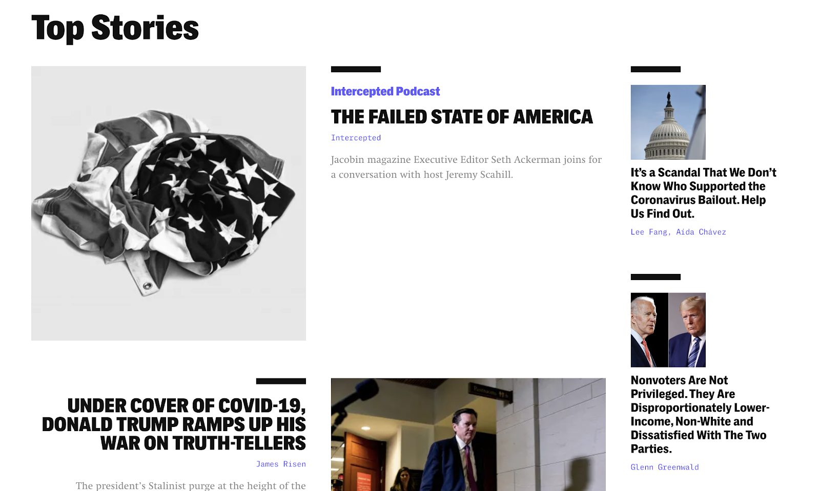
The top menu is broken down into the top news stories they cover, and if you scroll down, you’ll see large, high-quality images that entice readers to keep reading.
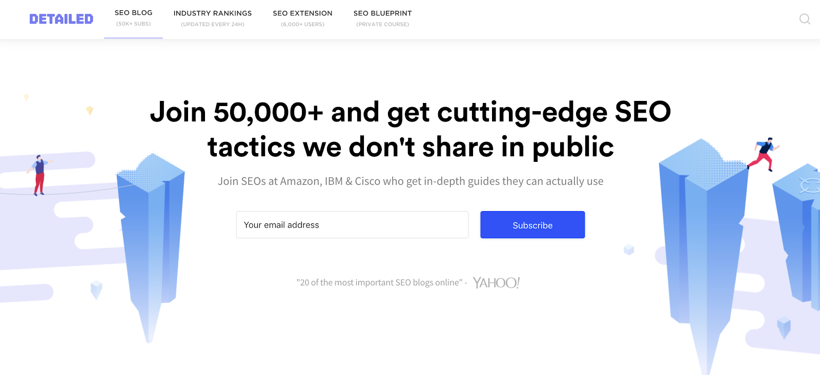
2. Detailed: Conversion-Optimized, Minimalist Blog Layout
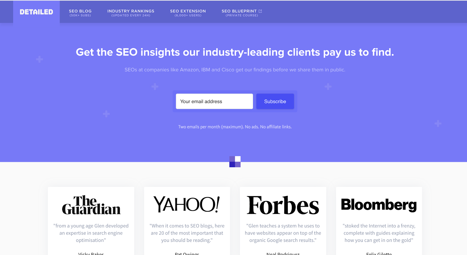
Detailed is an SEO insights blog, operated by famed SEO Glen Allsop, where he also offers SEO consulting & courses. What’s so special about the blog layout of Detailed?
We’ll start with their homepage. From the very top, Detailed is ready to grow their email list with a clear call to action above the fold. They’ve made it a top priority by placing it at the beginning of their page. Quick aside—if you haven’t already started doing so, I highly recommend ramping up your email marketing plan for your blog.
The next thing that Detailed does very well is to establish their authority. They have positive reviews from several well-known publications and brands that they highlight clearly. People will recognize these brands and instantly begin to trust Detailed as a source of information about SEO. If Bloomberg and Forbes offer their endorsement, this must be something good.
Now, take a look at the blog layout they’ve used on their blog feed page:
Once again, they’ve placed an email opt-in form at the very top of the page—also making it more enticing by including the names “Amazon,” “IBM,” and “Cisco” as subscribers on his list.
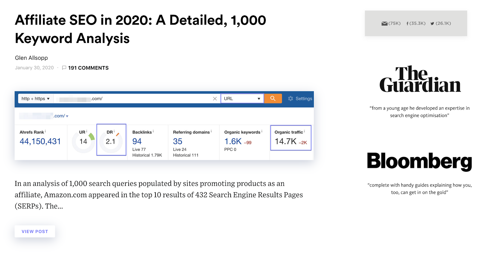
Scrolling down, we can analyze the design of their blog post. Detailed’s blog layout is very minimalist, with a lot of white space around their images and text. On the sidebar, they show the companies who’ve endorsed them and a ticker showing how many email subscribers they have—and how many people follow them on Facebook and Twitter—all great social proof.
Detailed does two things very well. The first is building trust with their readers and potential readers. They focus on showing visitors what makes them unique and what they offer. The second is to make their content exciting and engaging enough to entice readers to keep going.
Here are a few of the elements they use to make you want to continue reading their content:
- Comments counter (encourages engagement)
- An interesting snippet of text that leads into the blog post
- A very clear “View Post” call to action button
Detailed’s blog layout is simple but very effective at converting their readers—and directing people to where they want to go.
3. Ahrefs: Visually Appealing and Easily Navigated Blog Layout
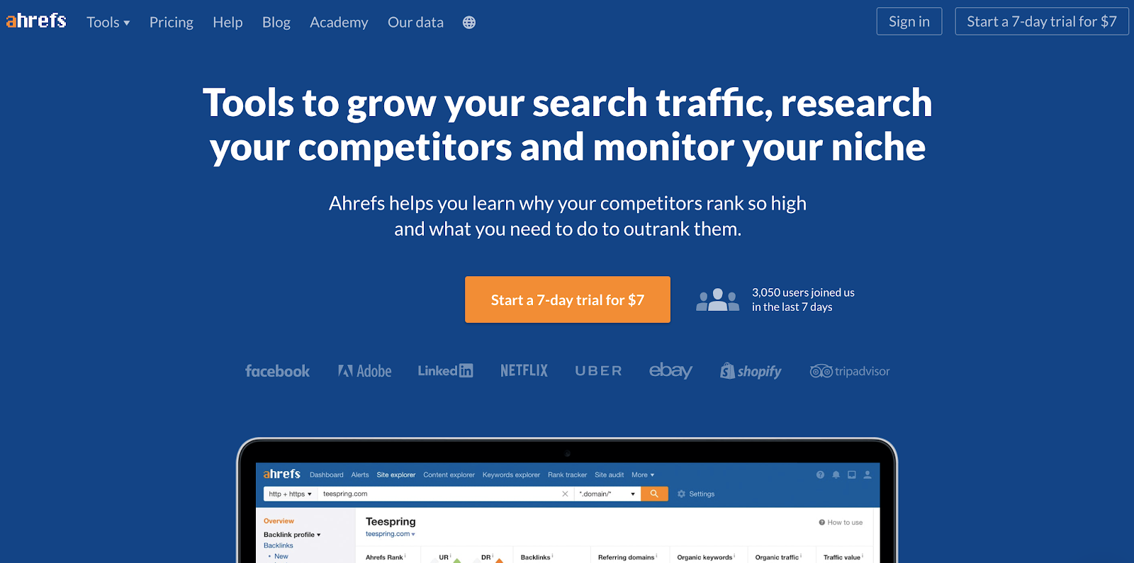
Ahrefs is one of the top blogging tools that I can recommend to bloggers—and I use it for all of my more in-depth keyword research (beyond my own free keyword research tool), competitor analysis, monitoring backlinks, and quick on-page SEO feedback.
In addition to their premium features, Ahrefs has a robust (free) library of blog content that provides helpful insights into SEO and digital marketing. We’ve already covered blog layout design points like minimalism and utilization of white space, so I’ll shift my focus a little to what makes the Ahrefs blog layout so appealing to me.
One thing that noticeably stands out about the Ahrefs blog layout is its color scheme. They chose three main (complementary) colors for their design: blue, white, and small pops of light orange. This color pattern is repeated in various forms throughout their website, in their logo, and in other visual elements.
Here’s a snapshot of the Ahrefs blog homepage:
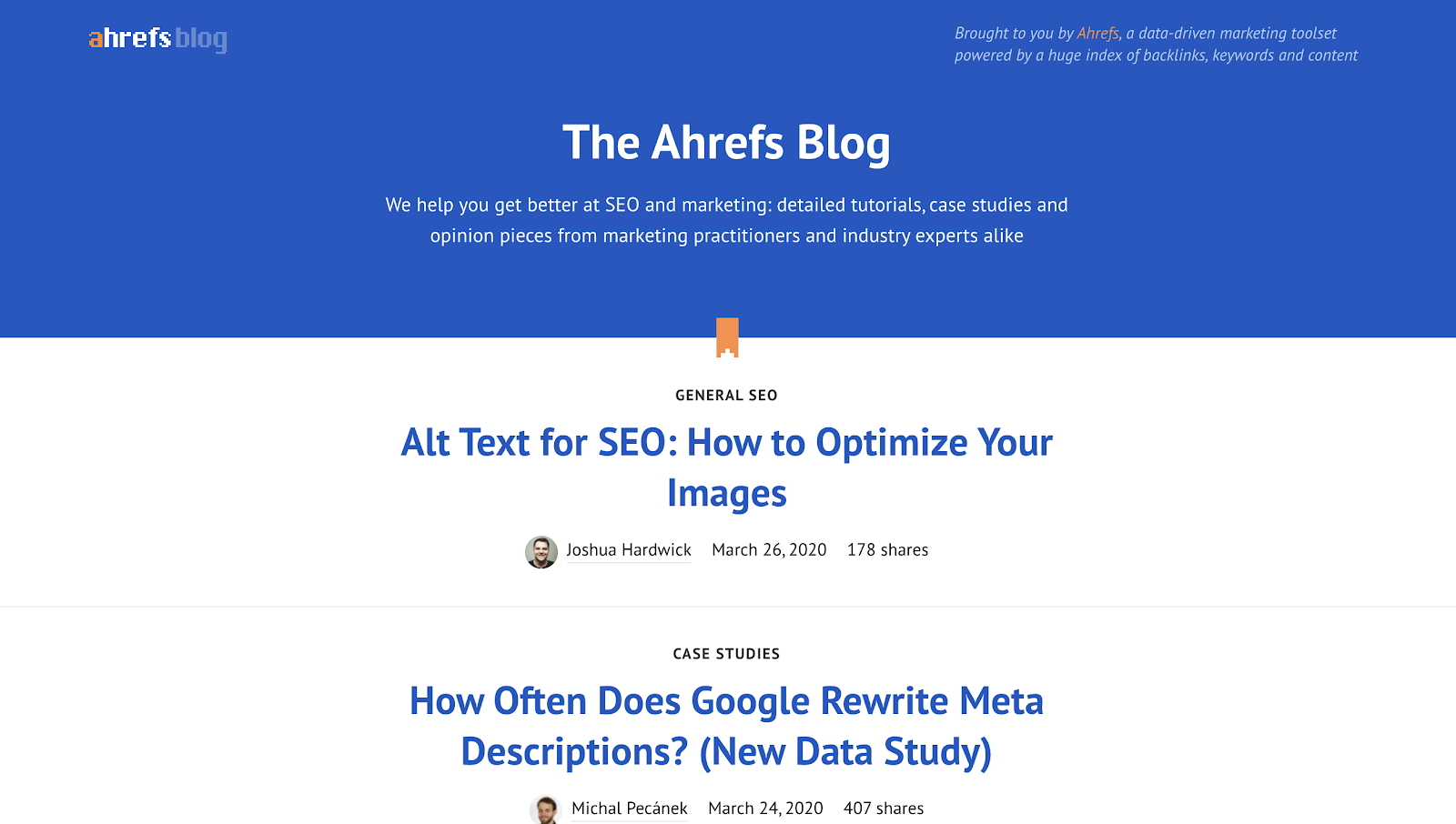
You can see that they’ve alternated between their core colors of white and blue throughout their blog homepage. The top of the page has a blue graphic with white writing, while the blog posts feature blue headlines on a page of plain white with a little orange accent.
Their blog layout design is simple but also very easy to navigate. At a glance, you can discover all the information you’re seeking to find (and easily navigate right to it).
4. The New York Times: Organized Chaos Blog Layout
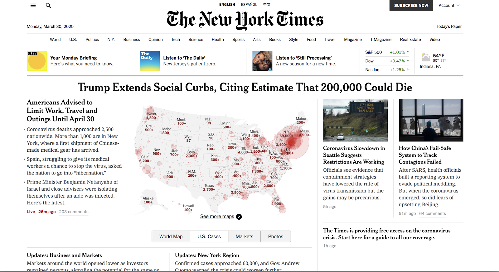
The New York Times has taken a very smart blogging strategy in crafting their blog layout by blending its print image with its digital one. As you can see, their site looks very similar to their print newspaper. Ordinarily, this blog layout may look way too overcrowded for a new visitor. However, most people who land here will already be familiar with this layout from the newspaper’s physical form. That makes this blog layout much easier to decode—and gives you a higher level of appreciation for the decision to lead with this design choice.
Another positive aspect about this style is that it allows you to see a lot of interesting content all at once. Some people will look at this front page and go directly to one of the top links—for example, if they visited the NYT to look at real estate, they’ll head straight there. Others will be instantly drawn to the map of the United States and click into that story.
Even though there are a lot of things happening on this page, it’s still very organized, with distinct sections and high-quality images.
5. Medium: Minimalist Publication-Style Blog Layout
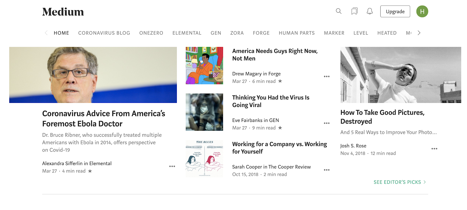
Medium is one of the top free blogging platforms on the market, and they allow you to post new content (or repost content from an existing blog). It can be a great tool for promoting your existing blog content and getting more exposure with a new audience—but can also be used as a stand-alone blogging platform if you’re on a budget.
Something that instantly stands out about Medium’s blog layout is its use of typography. The platform uses large, easy-to-read fonts.
Unlike The New York Times, the overall design of Medium is very clean, easy to navigate, and free from unnecessary clutter.
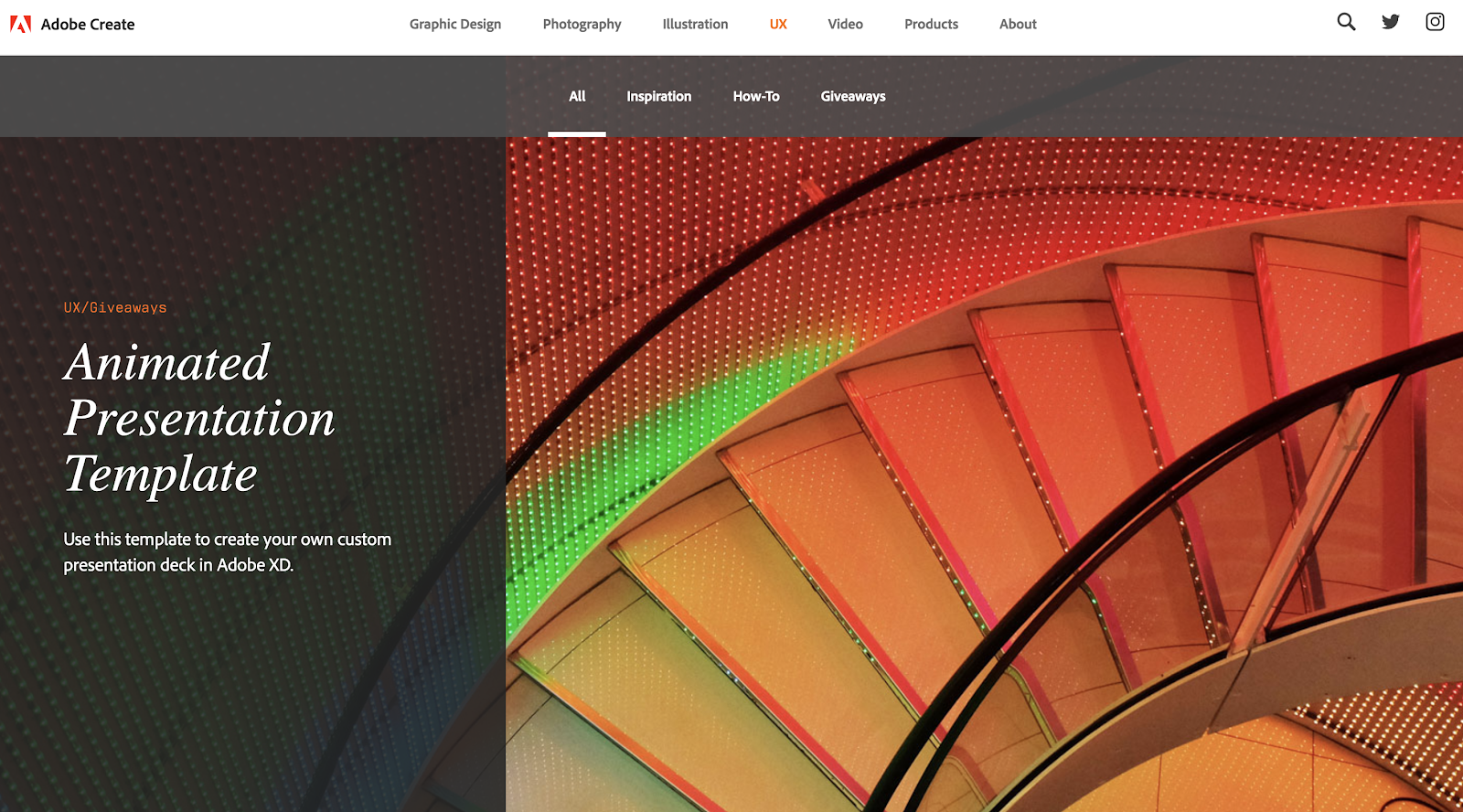
6. Adobe Create: Artistic and Creative Blog Layout (Historical Example)
Many of the blog layouts I’ve highlighted so far have been a little more traditional and minimalist, but if you’re more creative, you’ll appreciate Adobe Create’s design approach. Heads up: Adobe quietly discontinued Adobe Create (create.adobe.com) — the page no longer resolves as of 2026, and Adobe’s editorial content has moved to blog.adobe.com. We’re keeping the screenshots here as a historical example because the layout principles still apply, even though you can’t visit the original site anymore.
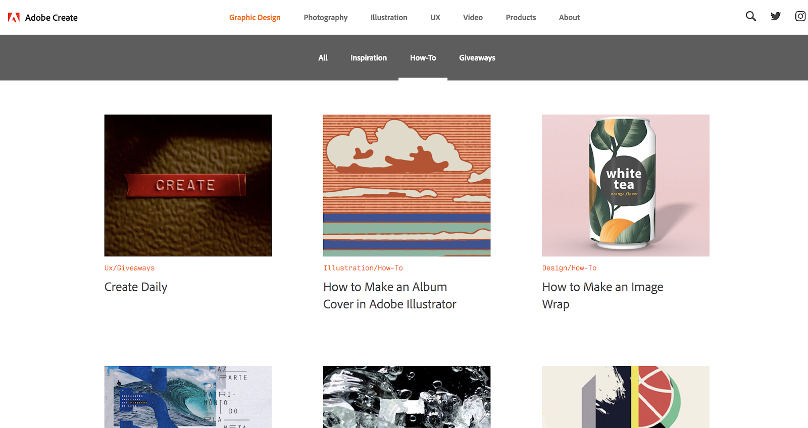
Adobe has long given creators tools like Photoshop, Illustrator, Lightroom, Audition, and many others. Adobe Create was their accompanying blog dedicated to artists and creatives — sharing inspiration and how-tos for photography, graphic design, illustration, UX, and video. While the site itself is now gone, the layout choices it made are still worth studying.
One element that stands out about this blog is the artistic imagery that leads the way. Each section of the Adobe Create blog starts with a striking image:
This artistic flair continues as you scroll down the page. The featured images for each of their blog posts are chosen to be interesting, unique, and beautiful.
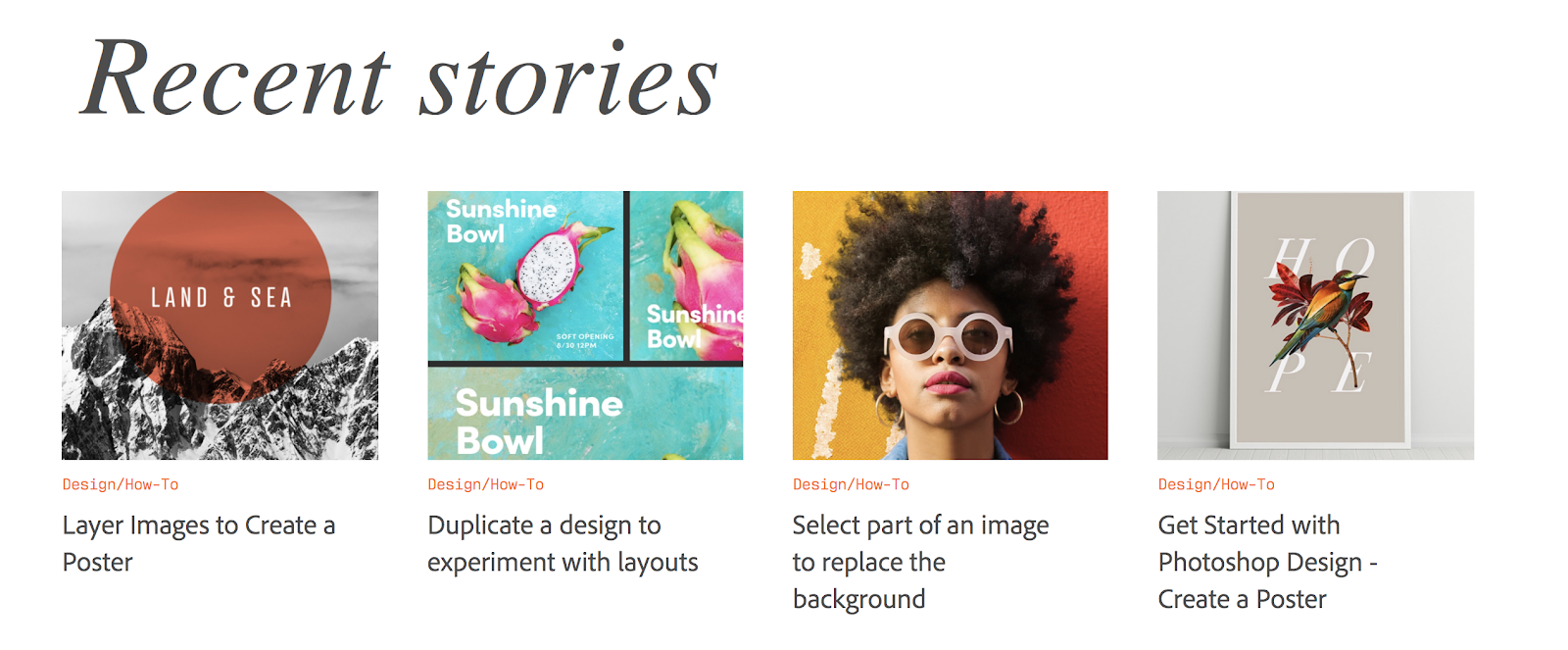
This blog layout by Adobe relies very heavily on images to entertain their readers and encourage them to click through to read stories—much more than headlines traditionally do.
7. The Dowse Art Museum: Non-Traditional Gallery-Style Blog Layout
I wanted to include the Dowse Art Museum here as an example because its blog layout is completely different from that of just about any other site you’ll find today.
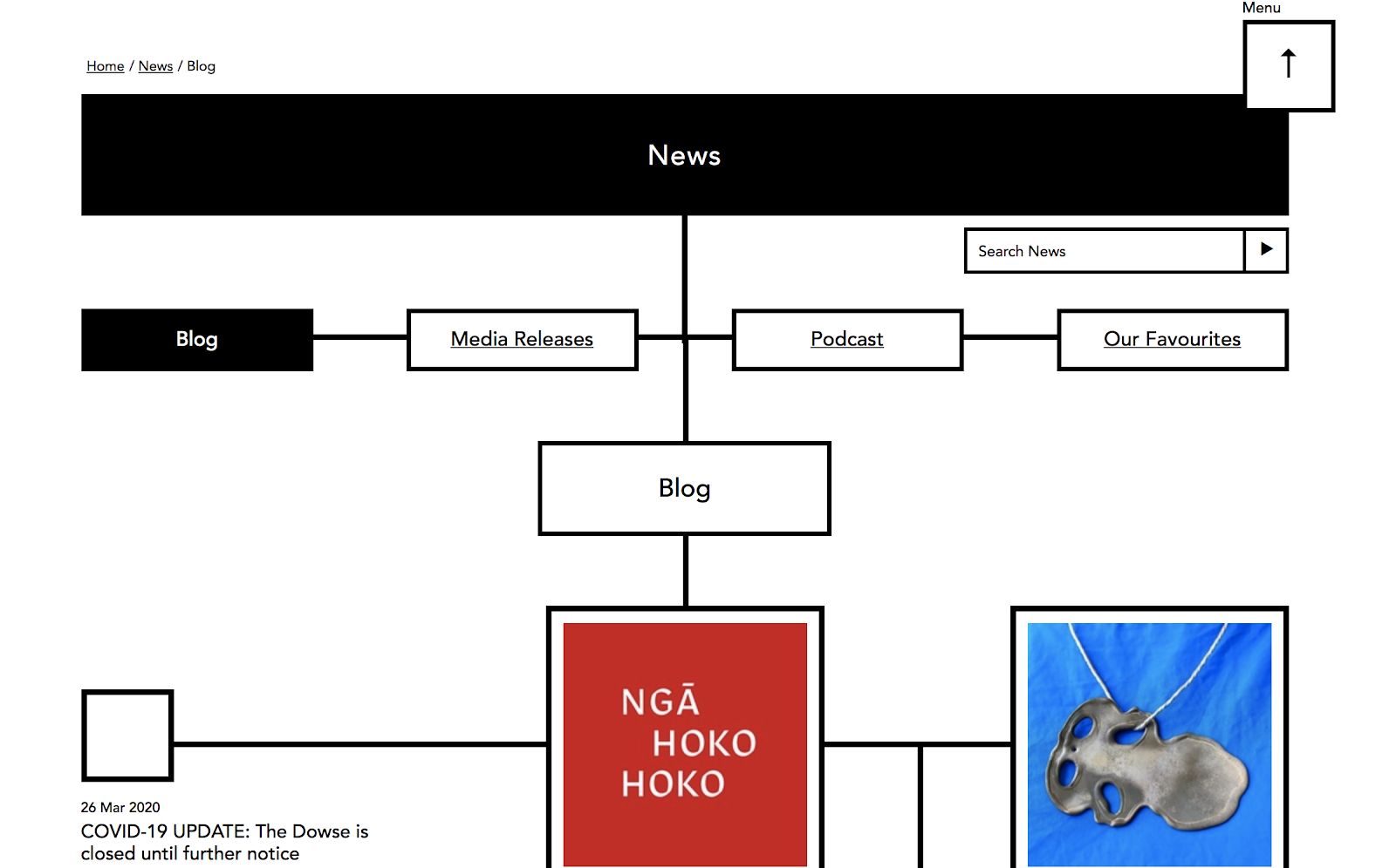
While each blog post certainly stands out from the others, they’re also placed in specific spots to look more like an art gallery display.
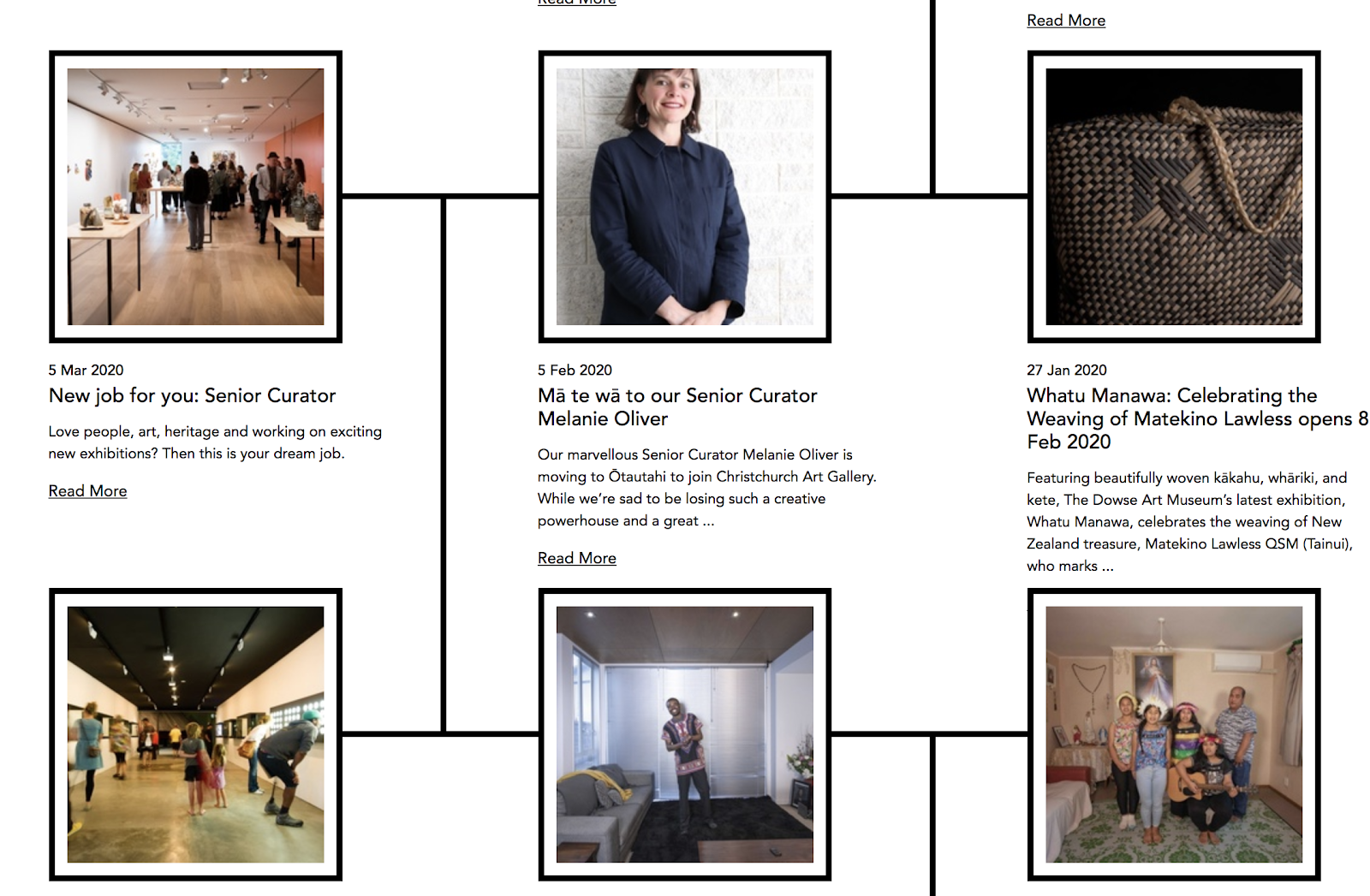
While probably not the best design choice for most bloggers, this is a very fun, unique, and creative way to display posts and set them apart from more traditional blogs. As a bonus, the museum has gotten a lot of press and attention for its unique blog layout over the years.
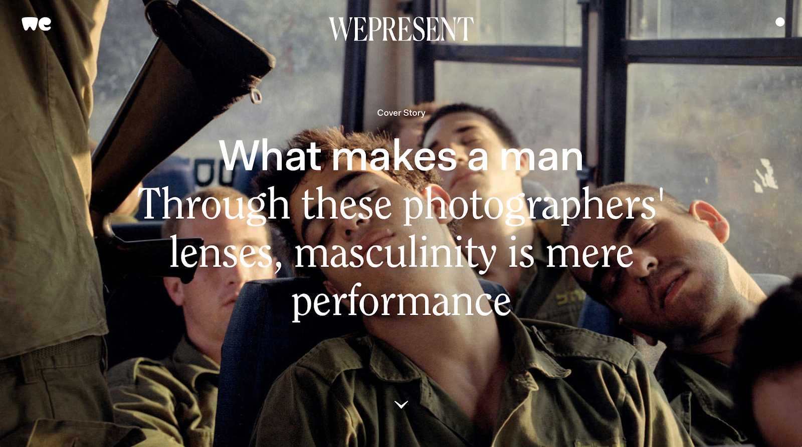
8. WePresent: Bold, Image-Heavy Blog Layout
WePresent is a creative blog that showcases art, photography, and music with a spotlight on diversity. The blog layout lets the art draw in readers with very little text and a consistent emphasis on imagery. The homepage begins with one large cover story image and very minimal text. Worth noting: WePresent’s parent company WeTransfer was acquired by Bending Spoons in July 2024 and underwent significant staff cuts in late 2024. WePresent continues to operate as of 2026, but its long-term future is less certain than it was a few years ago.
Below the cover story, there is a selection of images, each leading to a unique story on their blog.
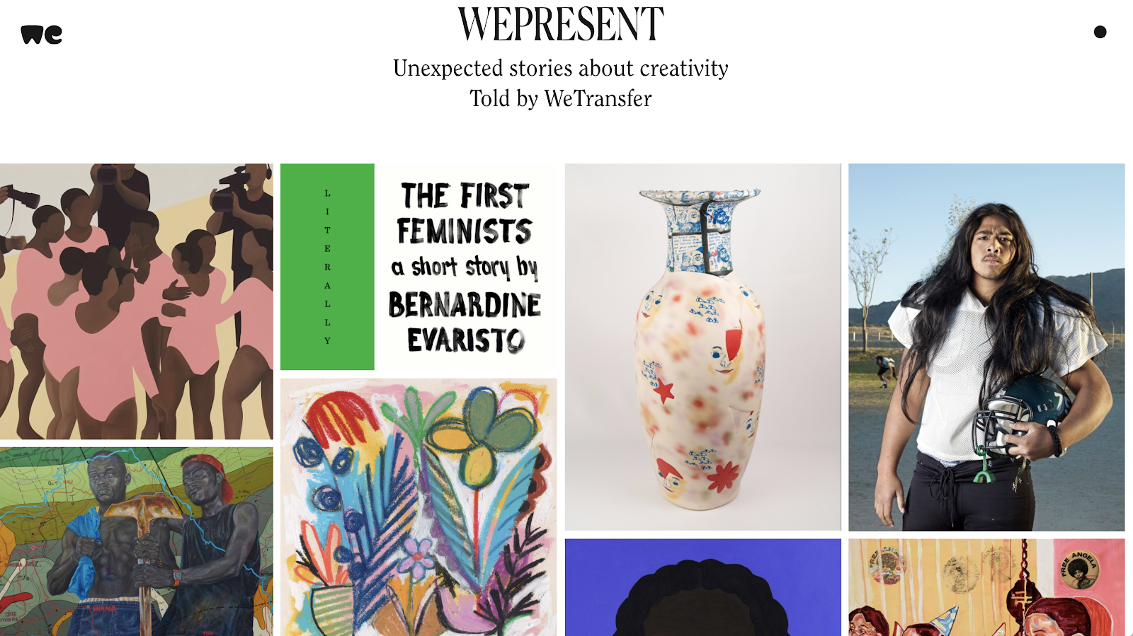
It may seem risky to post images without explanation and expect people to continue reading. However, this blog is playing to its audience. It likely attracts readers who will be interested in the images for their artistic quality. The effect is a blog layout that looks like an art display. It’s aesthetically captivating.
Further down, WePresent introduces snippets of stories, but the taglines are just as interesting as their corresponding images.
WePresent is a great example of not only designing a unique blog layout that you don’t find much of online, but of also creating an experience that appeals to their target audience.
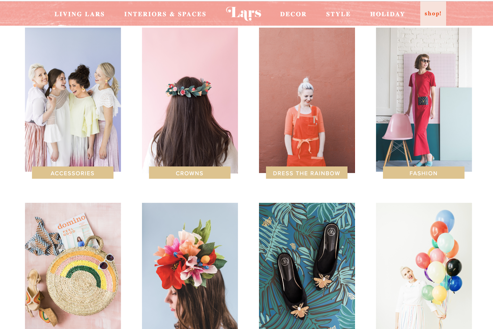
9. The House That Lars Built: Playful and Light Blog Layout
Another creative blog layout with a completely different feel is The House That Lars Built. This blog covers an array of topics from crafts, interior design, decor and style. The first thing that stands out immediately about this blog layout is their color scheme. They use pastel colors that feel joyful and light:
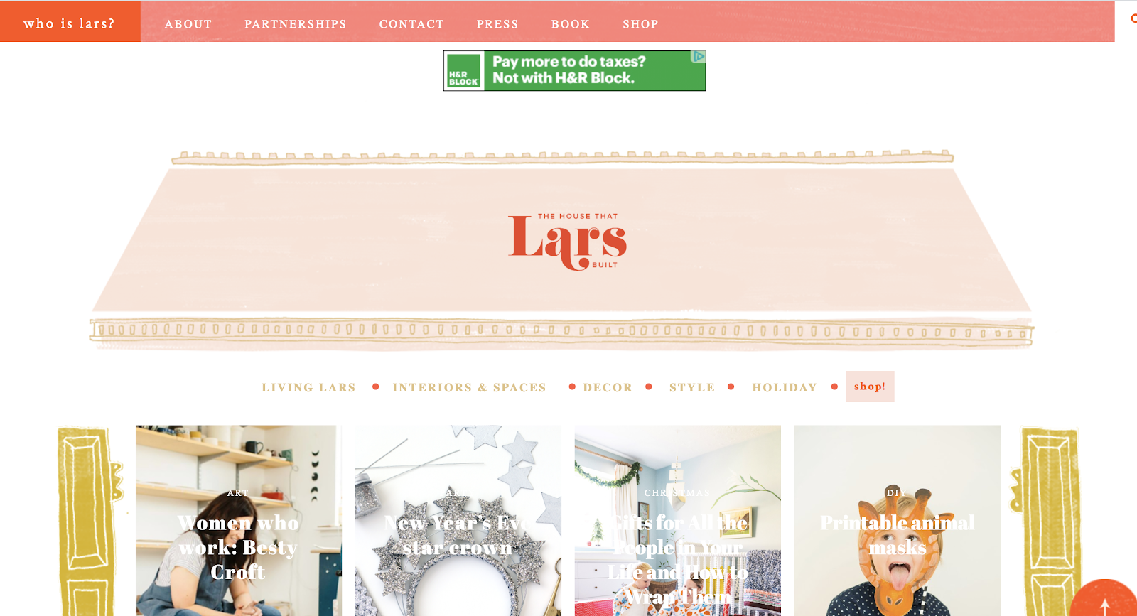
The House that Lars Built takes on the difficult task of including a lot of content without crossing over into an overly cluttered design. It’s a fine line to walk. Each section is visually attractive enough to make them distinct from other elements.
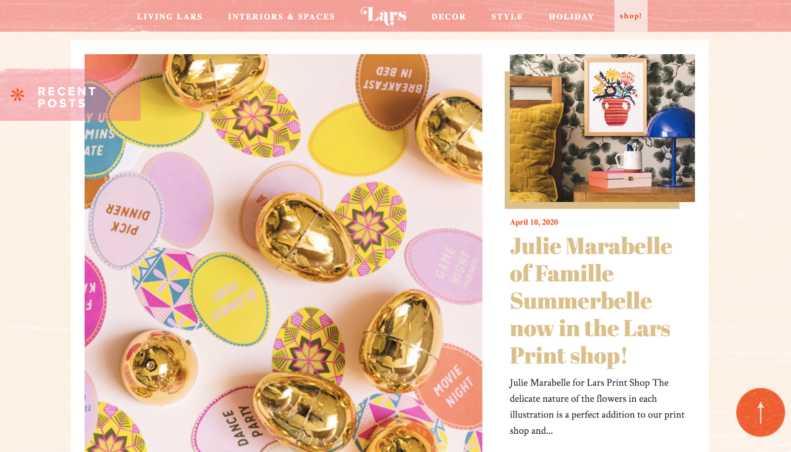
As with WePresent, this blog goes out of its way to appeal to a very particular audience—readers who are seeking bright, happy, and uplifting images, artistic ideas, and inspiration.
10. Magnum Photos: Photography-First Blog Layout
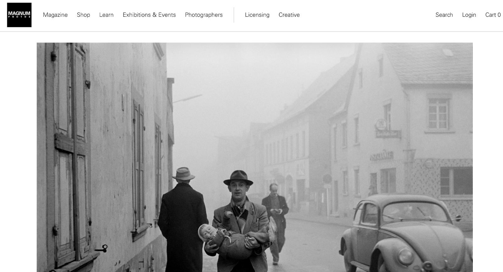
Magnum Photos is a photography blog with a deep interest in storytelling. As with some other creative blogs, Magnum Photos uses photography as the primary blog layout vehicle to drive the story. Magnum Photos uses interesting images and high-quality photography to display their posts.
Many stories are also shared from history, so some images are black and white. Using black and white is a unique way to make images stand out, especially when the eye is accustomed to seeing colorful pictures.
11. The New Yorker: Minimalist, Graphic-Driven Publication Blog Layout
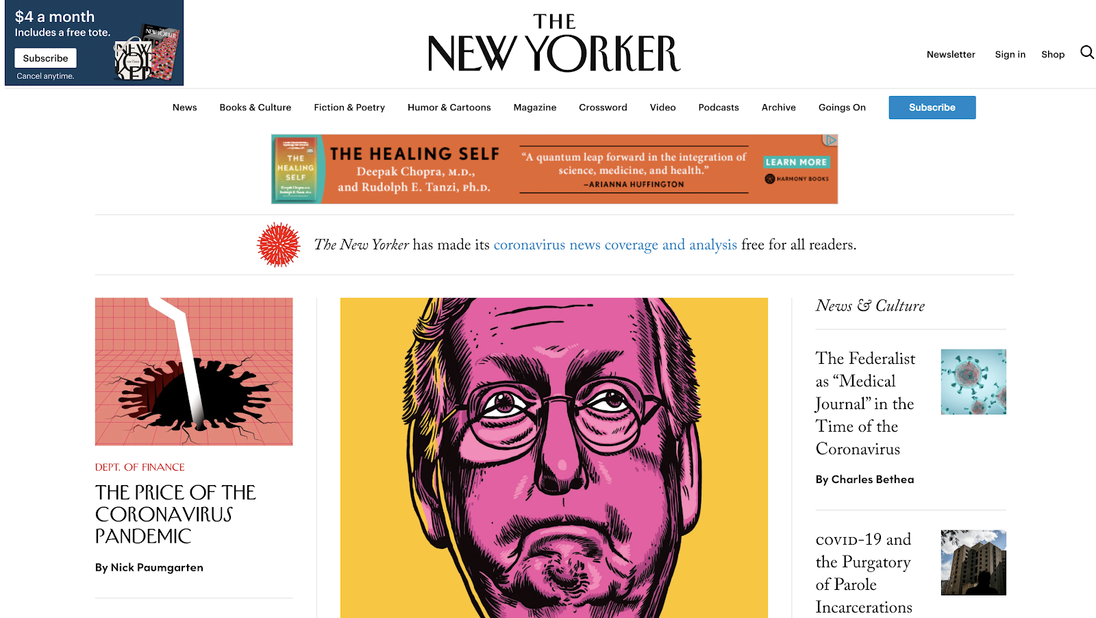
The New Yorker is known for using sarcasm and clever writing throughout their publication. This vibe continues with their choice of artwork and even their overall blog layout. They have a real personality that appeals very strongly to their audience.
Like The New York Times, The New Yorker has an online layout that resembles the (original) print publication. As you peruse their site, you’ll feel like you’re looking at a physical magazine.
Here’s a sampling of recent stories from The New Yorker. The typography they use for their headings is easy to read but a little more interesting than your basic Arial.
They also use images that are unusual and sometimes even a little absurd, to catch the attention of a reader instantly. Why is someone holding a smoking piece of glass that resembles a cell phone?
The New Yorker can rely on its history of well-written publications to entice readers to leap, even when the snippets and images are ambiguous. They tease out just enough of a story to make their readers want to learn more.
12. The Verge: Futuristic, Bold, Tech-Driven Blog Layout
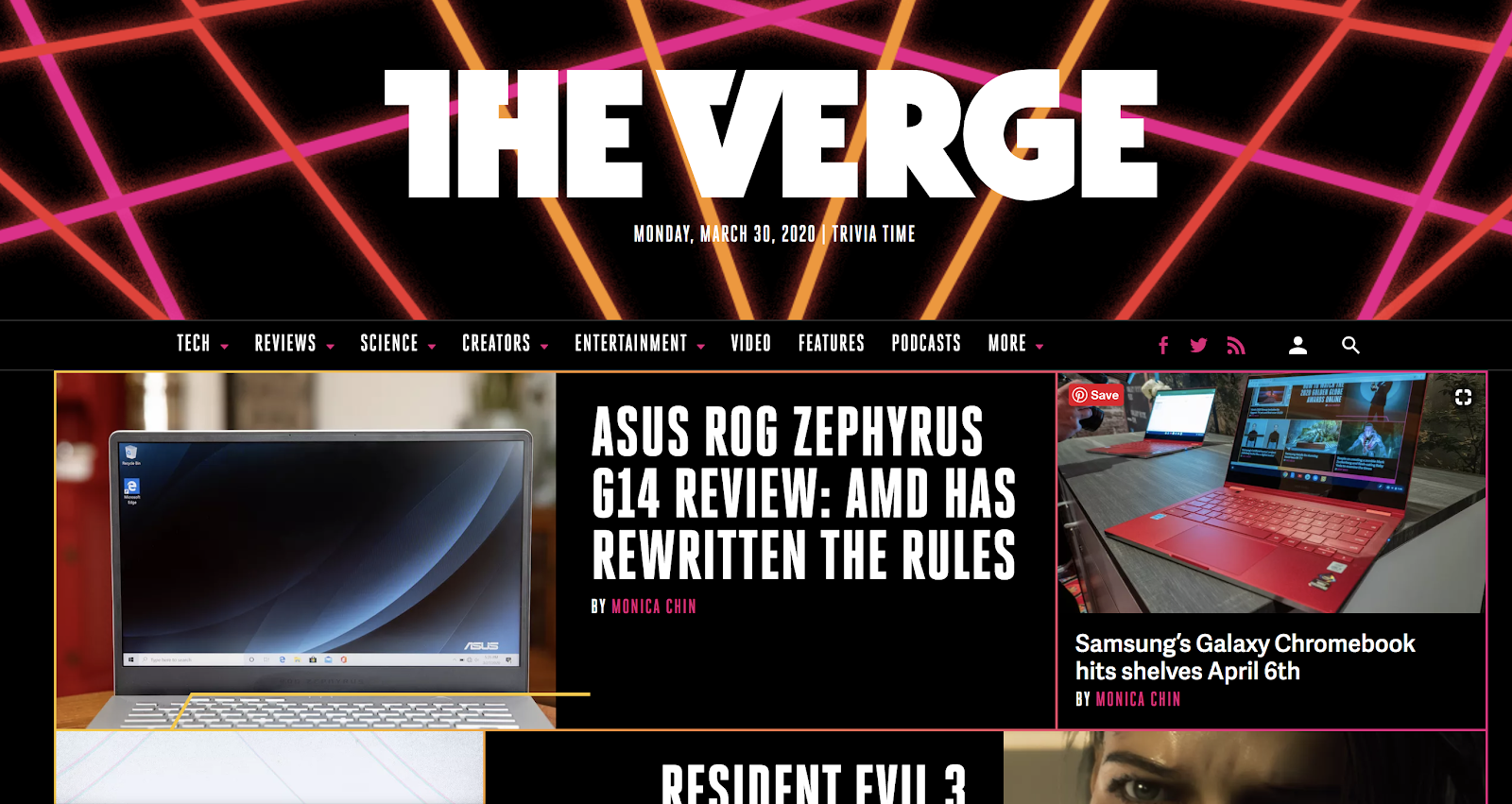
The Verge is a multimedia blog that examines how technology changes the lives of people around the world. It predicts which technological advancements will affect the average person in the future.
So, what stands out about their blog layout? For one thing, their choice of design looks like a technicolor dream straight out of the 1980s. But instead of making the blog appear outdated, it makes visitors nostalgic for the 80s, when technology and the rise of computers started to change the landscape of our culture.
The Verge doesn’t use a lot of negative space on their blog, but the way they use images and large bold fonts, keeps each section distinct and easy to find. The blog posts don’t just blend in with each other. Another thing to point out about this blog layout is the way they break down sections. In the navigation menu, they list all of their top categories.

Each one has a hover drop-down menu that further breaks categories into more specific subcategories. This functions as a version of a learning center for readers to dive deeper into the subject they care about.
This kind of easy navigation is a staple of blog layout best practices in terms of delivering a great user experience for your readers.
My Own (Minimalist) Blog Layout and Design Here at ryrob.com
Since you’re on my blog right now, I want to wrap this guide up by showcasing my own blog layout since I went through a complete redesign in early 2020.
The primary reason why I decided to redesign my blog layout was because I’d been using the same theme & overall design format for more than five years. The technology was adding a lot of bloat to the pages on my site, making them load much slower than needed, and the visual elements didn’t feel representative of the person I’d become since I started my blog.
This new redesign simplified a lot of things, translated my very bold messaging style into visual elements across my site—and gave me a major performance boost, too. So, let’s dig into a few of these new layout elements.
Very Simple Design
One thing that stands out about my blog layout is how incredibly simple the design is. In my header menu, there are only a few easy-to-see links, my logo, and a search bar.
I omit a top header image on the blog homepage and instead focus on my blog posts and featured images as the driving forces. This style of blog could be described as clean and minimalist.
The benefit of a minimalist design is how easy it is for readers to navigate. Visitors to my blog won’t have to spend a lot of time locating important information about my blog. Everything is visible at a glance, and the eye isn’t distracted by a lot of text and images.
Centered Article Collection (in Order of Publication Date)
In my recent website redesign, my blog posts went from a grid-style display down to a list display. Now, instead of seeing multiple blog posts at once (which can be overwhelming), readers see one large featured image and the corresponding blog post at a time. These posts are in order of publication date:
Utilization of White Space
We already covered that my blog layout is intentionally minimalist, but one element of this is the utilization of white space. White space, sometimes called negative space, is the part of your blog layout that doesn’t have any imagery, ads, or text represented—nothing else is going on there.
As we talked about earlier, the purpose of negative space is to draw more attention to the key features you want to highlight on your blog.
If you’ve ever seen a blog full of blinking ads, sidebars, and cluttered headers & footers, you know what I’m talking about. White space isn’t entirely necessary if the site still looks clean and professional. However, that negative space trains the reader’s eyes on where you want them to go.
Font Type and Sizing
Choosing a font size and type is relatively easy. The main thing here is to pick something easy to read. Text that’s too small or hard to decipher will raise your bounce rate.
As we discussed earlier, I use a custom font similar to Josefin Slab, with a body text font size of 16px.
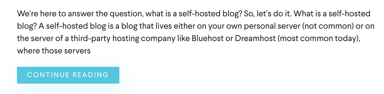
Enticing Descriptions and “Continue Reading” CTA Button
Whether they use a list or grid style to display their blog posts, most bloggers include a short description of their blog posts to be sampled for readers. Your blog visitors will decide whether to continue reading based on the featured image and the description you’ve provided, so make it good.
Don’t squander this description. Try to write something that’ll entice them to keep reading, and include a “Continue Reading” call to action button:
Pagination at the Bottom
Another way to encourage people to read your content is to include clear pagination at the bottom of your list of blog posts. This shows readers that you have more content and encourages them to discover more on your site.
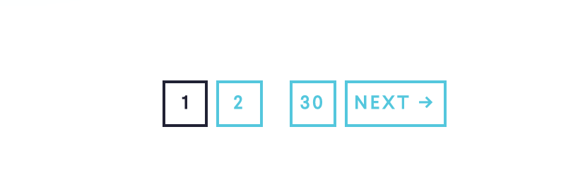
This feature also keeps your blog homepage from overloading content that runs on a continuous scroll.
Taking Advantage of the Footer
The footer is the final thing I’d like to point out about my blog layout. The footer of your blog can be used for various key links, pages, and calls to action. I take advantage of my footer section on individual blog posts and all the pages across my site to encourage further engagement with my readers.
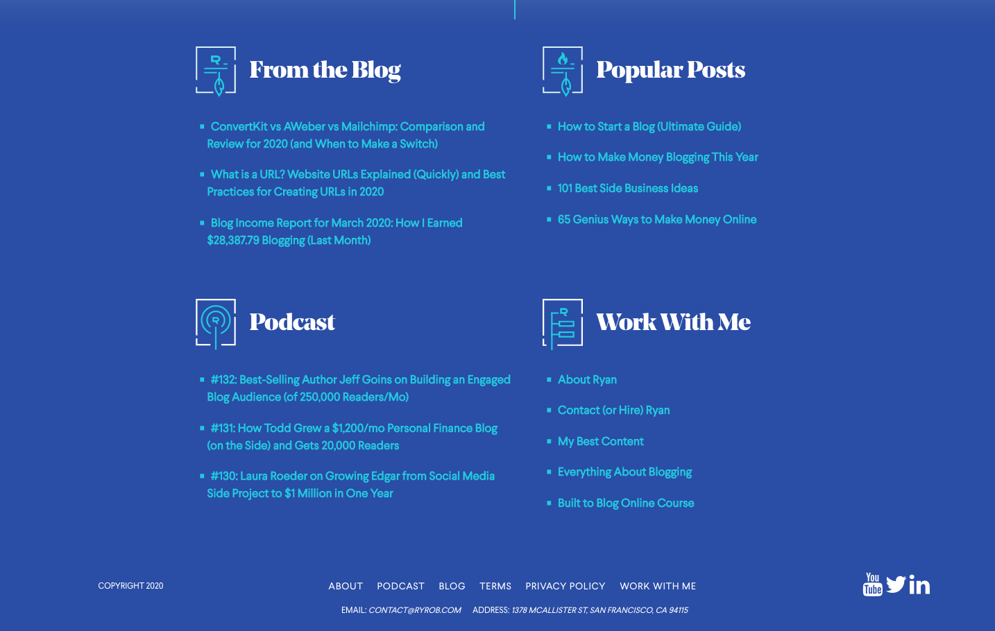
In my footer section, I include several important links, which are broken down into relevant sections.
I share additional blog posts people might be interested in, some of my most popular posts, and my most recent podcast episodes. I also include a section called “Work With Me” that shares links to information about who I am, how to hire me, my best content, and my contact information.
And though this is technically above the actual footer of my blog, I take full advantage of the end of each blog post by incorporating a clear, single call to action for my readers to take:
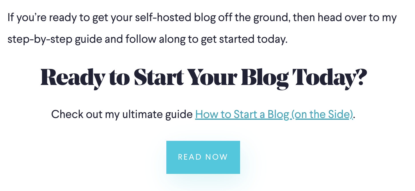
This call to action is at the bottom of just about every post on my blog. It’s in large text, asks a question, and utilizes a unique button that readers can click on. The introduction of these elements makes it easier for people to find more relevant information (and to direct them to content pieces like my list of the best blogging jobs sites or top WordPress developer jobs sites—something I know most of my readers are interested in).
I also share some information about myself and my blog (as the author) at the bottom of each blog post, and I have an easy-to-locate comment widget.
That’s a wrap on the ways my blog layout was intentionally (re)designed earlier this year.
Each section of my blog is carefully thought out and planned to encourage people to stay on my blog and explore all it offers (check out my free blog planner for more).
The minimalist style is meant to make it easy to find information—and feel extremely free from distraction when you’re reading one of my long-form guides (like this here).
Your blog layout may not look like mine, and that’s fine!
Diversity is a strength in the blogging world, so it’s better when our blogs aren’t just copies of each other. Even so, these blog layout and design best practices will make your own blog stand out.
Blog Layout: FAQ
What makes a good blog layout in 2026?
What makes a good blog layout in 2026?
A good blog layout in 2026 prioritizes scannability, fast load times, and mobile-first design. The 10 best practices in this guide still all apply: readable fonts (16-18px body text), clear navigation, plenty of white space, high-quality images, strong CTAs, and clean branding. What’s changed: layouts also need to work well as Google AI Overviews and ChatGPT pull from them — meaning clear H2/H3 structure with direct answers near the top performs better than buried content.
What’s the ideal blog post layout for readability?
What’s the ideal blog post layout for readability?
For maximum readability: a single-column layout (no sidebar on mobile), 16-18px body font size, comfortable line-height (1.6-1.8), high-contrast text on a light background, short paragraphs (2-4 sentences each), bolded key phrases, and H2/H3 subheadings every 200-300 words. Aim for a reading-width of 60-80 characters per line — too wide is hard to read, too narrow feels cramped.
Should my blog have a sidebar in 2026?
Should my blog have a sidebar in 2026?
For blog post pages specifically: usually no, or only a very minimal one (table of contents, maybe one CTA). The trend in 2026 is toward single-column post layouts because they’re cleaner on mobile (where most traffic comes from) and reduce visual clutter. Sidebars still work for blog index/category pages or homepages where you’re showcasing multiple posts. The most-shared blog posts of 2026 (NYT, Medium, Substack, Ghost) all use single-column post layouts.
What blog layout converts best?
What blog layout converts best?
Conversion-optimized blog layouts share a few traits: prominent email signup forms (above the fold and at content milestones — not just at the bottom), clear CTAs placed contextually within content, social proof early (testimonials, subscriber count, press logos), and clean navigation that doesn’t distract from the conversion goal. Detailed.com (#2 in this guide) and ryrob.com itself are good examples — they prioritize one or two clear next actions rather than offering 10 different paths.
What fonts should I use for my blog?
What fonts should I use for my blog?
Stick to web-safe fonts that load fast and read cleanly. Strong choices in 2026: Inter (highly readable, used by GitHub, Stripe, Mozilla), Source Sans Pro, Open Sans, Lora (for serif body text), Merriweather, and Roboto. Pair a clean sans-serif for body text with either the same family for headings or a contrasting serif. Avoid display fonts for body copy — they look fancy but kill readability.
How long should the average blog post layout be?
How long should the average blog post layout be?
For SEO blog posts, design for 1,500-2,000 word reading length as your default — that’s the sweet spot for most search-driven content in 2026. Use subheadings every 200-300 words to break it up. For shorter content (news, FAQ-style answers), 500-800 words is fine, especially if you’re optimizing for AI Overview citations where shorter, more focused content often wins. There’s no one “right” length — match the content depth to what readers actually need.
How important is mobile design for a blog layout?
How important is mobile design for a blog layout?
Critical. Roughly 60-70% of blog traffic comes from mobile devices in 2026, and Google uses mobile-first indexing for ranking. If your blog layout looks great on desktop but breaks on mobile, you’re losing both readers and search rankings. Always test your blog on a phone (real device, not just browser dev tools) and make sure: text is readable without zooming, buttons/links are tap-friendly (at least 44px tall), images scale appropriately, and ads/popups don’t cover the content.
What Are You Going to Do With Your Own Blog Layout?
Now that we’ve covered all of the most crucial blog layout best practices and analyzed a ton of blog layout examples, how will you structure the design of your own blog?
Now it’s time for you to take what you’ve learned—and apply it to your own blog layout and overall site design.
- How are you going to take these blog layout ideas and tailor them to fit your vision?
- What do you like (and dislike) about the blog layout examples you’ve seen here?
- Did you find any blog layout mistakes you’ve made that you’re now ready to fix?
Remember, nobody should ever create a carbon copy clone of another person’s blog layout. That’s a form of plagiarism. But you can still take a lot of inspiration from the blog layouts you’ve seen in this guide because they’ve been intentionally designed to attract (and retain) readers over the course of many years.
Grab the right WordPress theme that can set you down the path to perfecting your blog’s design (and augment it with key WordPress plugins) today.
Keep in mind that these blog layouts follow proven best practices designed to keep your bounce rate low and encourage people to return to your blog for more.
Want to Start Your Blog (the Right Way)?
Read my ultimate guide to starting a blog, which has been featured on Forbes, Entrepreneur and Business Insider.
200 replies to “12 Blog Layout Examples (and Best Practices to Follow) in 2026: Great Blog Designs”
It is worth the reading and I will copy a couple of ideas. Thank you heaps!
my man! you know I love to see Andreas pop into my comments section. hit me up if you want any feedback as you get crankin on your site again!
Wow, this post really opened my eyes to the importance of layout in retaining readers! I had no idea that fonts could play such a huge role in user experience. I’ll definitely be switching to a more readable font, like Georgia or Arial, for my blog’s body text. I also loved the section about creating a learning center. As my content grows, it would be a great way to help readers quickly find the topics they’re most interested in. Can’t wait to start implementing these changes!
This is such a helpful roundup of blog layouts! One challenge I often face is balancing visual appeal with readability—some designs look great but can overwhelm readers. Your examples really show how to structure content so it’s both engaging and easy to navigate. Thanks for sharing!